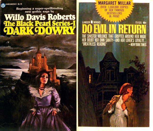
Across these two paperback covers, Gothic romance leans hard into its most magnetic promise: danger at the edge of home. One scene places a solitary woman in a windswept gown beneath a brooding sky, with a fortress-like house looming in the distance; the other frames a woman mid-flight, glancing back at a shadowed mansion whose steep rooflines and dark windows feel almost watchful. The painted drama—storm clouds, harsh contrasts, and looming architecture—doesn’t just set a mood; it advertises a psychological contest between curiosity and self-preservation that defines the genre’s visual language.
What makes the “woman running from the house” motif so enduring is how efficiently it turns a building into a character. The mansion or castle isn’t merely a backdrop; it becomes the physical shape of secrecy, inheritance, and unspoken history, while the fleeing figure embodies the reader’s own tension between wanting answers and fearing what those answers might cost. In cover art like this, movement matters: a turned shoulder, a half-lit face, and a door implied more than shown suggest that the real threat may not be outside at all, but waiting within—memory, doubt, or a relationship that feels both irresistible and unsafe.
For collectors and design historians, these covers are a reminder of how mid-century mass-market publishing used bold typography and cinematic painting to sell emotion at a glance. The oversized lettering, the urgent taglines, and the compressed narrative cues create instant SEO-friendly keywords—Gothic romance cover art, haunted house imagery, vintage paperback design, women in peril—while still leaving space for imagination to do the work. Seen together, they form a small gallery of Gothic romance psychology: a place where architecture stands for the past, flight stands for agency, and the reader is invited to chase the mystery anyway.