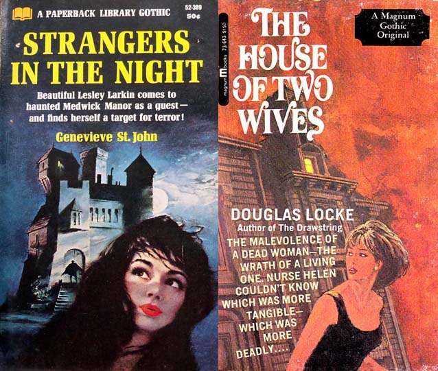
Paperback gothic romance cover art thrives on instant unease, and the paired designs here lean hard into that promise. On one side, a moonlit manor rises in sharp angles against a stormy sky while a wary woman’s face—lipstick bright against the darkness—anchors the viewer’s attention. On the other, a looming house tilts into a fiery, clouded background as a woman in a dark dress turns as if she has heard something behind her, caught between flight and fascination.
What makes the “woman running from the house” motif so psychologically sticky is how it stages a split-second decision: stay and uncover the secret, or flee and survive. These covers are built from familiar gothic signals—towering architecture, lit windows that feel like eyes, high-contrast color, and figures framed as vulnerable but alert—so the reader understands the stakes before a single page is turned. Even the typography and blurbs add pressure, promising strangers, wives, dread, and danger while keeping the true threat just out of reach.
For collectors, designers, and fans of gothic romance covers, these images offer a compact lesson in visual storytelling and suspense marketing. The houses read as characters—cold, heavy, and memory-filled—while the women carry the emotional narrative: curiosity, fear, desire, and determination. If you’re searching for gothic romance cover art, vintage paperback illustration, or the enduring appeal of heroines on the run, this post explores why that breathless dash from the doorstep still sells mystery so well.