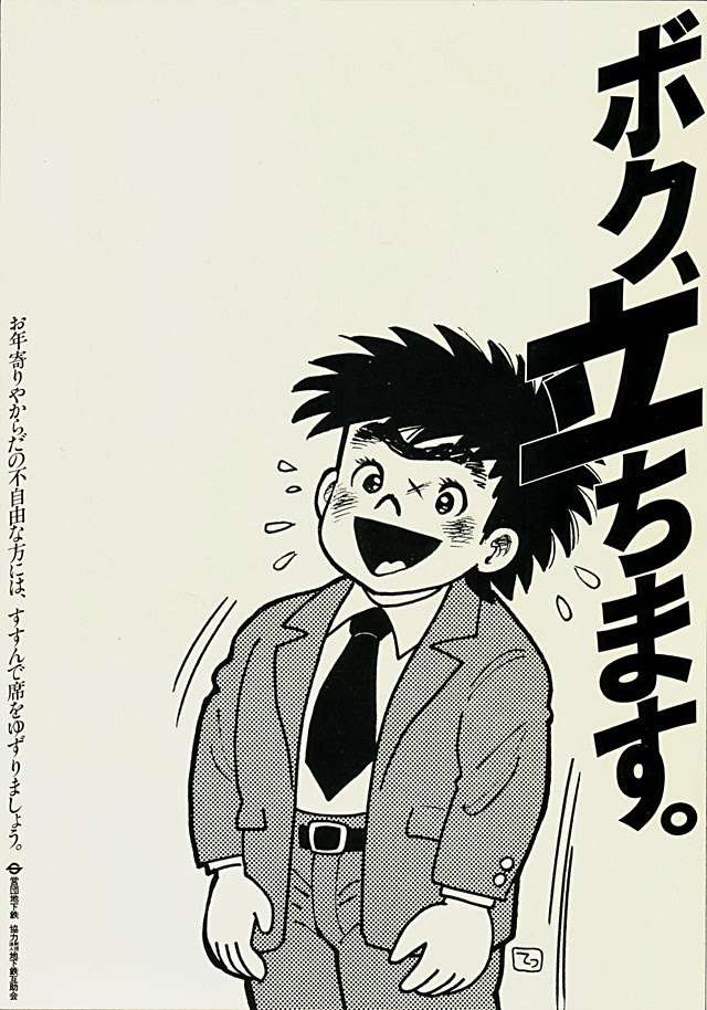
Bold Japanese lettering cuts down the right side of the page, turning typography into a kind of shout, while a cartoonish office worker leans forward mid-motion, cheeks flushed and mouth open as if calling out to the room. The figure’s suit, tie, and neatly belted trousers place the scene in an everyday workplace world, yet the exaggerated posture and sweat marks add urgency and humor. Even without translating every character, the design reads immediately as a poster-like appeal meant to be understood at a glance.
Dated in the title to July 1979, “I’ll stand up” carries the tone of a small rebellion made public—an everyday person pushing back against routine expectations. The composition emphasizes action over setting: there’s no detailed background, only the body language of someone rising, resisting, or refusing to stay quiet. That minimalist choice makes the message feel universal, letting the viewer project their own memories of offices, trains, meetings, and crowded rooms where standing up can be both literal and symbolic.
As an artwork, it also works as a snapshot of late-1970s graphic communication in Japan, when manga-influenced illustration and high-impact text often met in advertising and public messaging. The clean background, thick black type, and screen-tone shading give it a crisp, printable clarity that would have stood out on a wall or in a pamphlet. For collectors and readers interested in Japanese poster design, vintage illustration, or the social history behind everyday slogans, this piece invites a closer look at how a simple command can become a visual story.