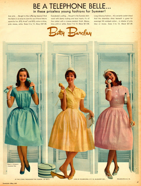
Pastel party dresses line up like a fashion chorus, each model posed with a telephone receiver to match the headline’s promise: “BE A TELEPHONE BELLE… in these priceless young fashions for Summer!” Against a clean backdrop of dressing-room doors, the ad turns everyday technology into a glamorous prop, suggesting that style and social life were inseparable. The name “Betty Barclay” anchors the spread, while the crisp typography and airy layout deliver that unmistakable mid-century magazine polish.
Three silhouettes keep the focus on the clothes: fitted bodices, nipped waists, and full skirts designed to swing, all rendered in soft, candy-colored tones of blue, yellow, and pink. Details—short sleeves, delicate collars, and coordinating heels—sell a complete look meant for afternoons out, phone calls at home, and whatever youthful summer the copy invites readers to imagine. Even the models’ playful hand positions with the cords add movement, making the ad feel like a scene rather than a static catalog page.
Seventeen magazine cover art and its surrounding advertisements shaped how teens and young women learned to read fashion in the 1960s, and this piece is a perfect example of that persuasive blend of illustration, aspiration, and consumer guidance. The “telephone belle” concept speaks to an era when communication happened on a cord, and being reachable was part of being modern. For collectors, designers, and retro-style fans, it’s a bright window into 1960s fashion marketing—where bold copy, brand identity, and groovy threads worked together to sell a lifestyle.