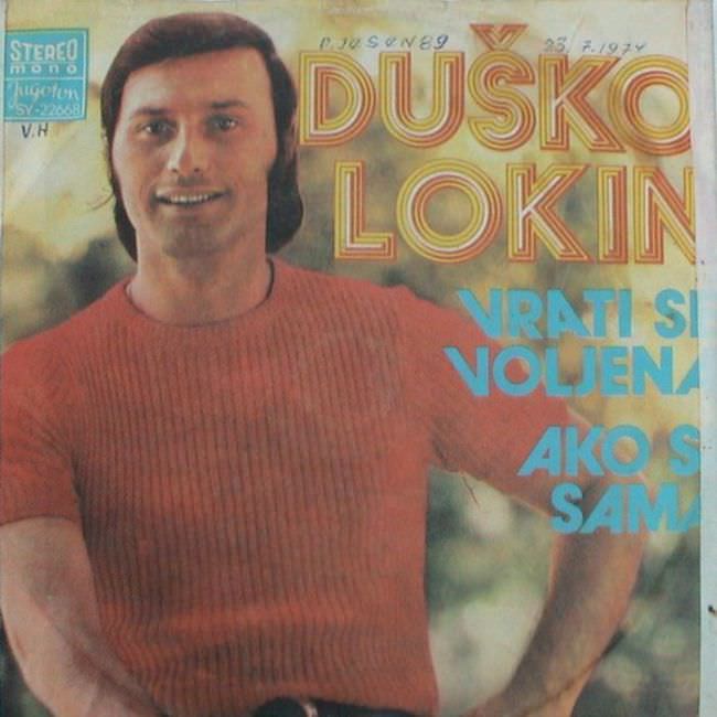
A smiling singer in a ribbed red sweater leans into the frame, as if posing for a magazine rather than a record sleeve, while the oversized block lettering “DUŠKO LOKIN” shouts his name across a hazy, outdoorsy backdrop. The design piles on bright, optimistic colors—sunset oranges and electric blues—creating that unmistakable late-20th-century pop sensibility where typography and charisma did most of the heavy lifting. Even the small “stereo” label in the corner feels like a badge of modernity, a selling point turned into decoration.
Yugoslavian album art in the 1970s and 1980s often lived in this uneasy space between earnest glamour and budget limitations, and that tension is part of what makes it so fascinating (and, for some viewers, so “ugly”). The straightforward portrait, the soft-focus background, and the emphatic text hierarchy favor immediacy over subtlety, aiming for quick recognition on a shop rack. Song titles like “VRATI SE VOLJENA” and “AKO S…” are treated like bold graphic elements, not quiet information, turning the cover into a loud poster for a personality.
What looks awkward today can read as a cultural time capsule: a visual language shaped by print constraints, regional trends, and the desire to project sophistication with whatever tools were available. The result is cover art that feels both intimate and oddly impersonal—one person’s face presented through a thick filter of commercial design choices. For collectors, designers, and anyone searching for Yugoslav record sleeves, Balkan pop aesthetics, or 1970s–1980s album cover history, this piece offers a vivid example of how taste, technology, and marketing collided on paper.