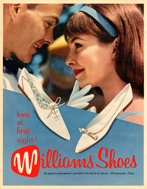
Bright lipstick, a sleek headband, and a close, smiling gaze set the tone for this piece of Seventeen-style cover art, where romance and retail meet in the language of mid-century teen dreams. The illustration leans into the era’s polished optimism—softly airbrushed skin tones, tidy hair, and a pastel palette that feels like a soda-shop day distilled into print. Even without a full magazine masthead in view, the vibe is unmistakably 1960s: youthful, curated, and ready for the next dance.
Front and center, the ad sells the fantasy through footwear: two pointed flats float like prized accessories, complete with petite bows and delicate detailing that reads as “dressy” without looking formal. The copy’s playful promise—“love at first sight!”—turns shopping into storytelling, while the bold, sweeping “Williams Shoes” logotype anchors the whole scene in confident, consumer-friendly design. Small-print pricing and the note “Portsmouth, Ohio” add a satisfying trace of real-world commerce beneath the glamour.
Fashion historians and retro-style fans will recognize how ads like this helped define what was “in” for a generation—less runway spectacle, more attainable refinement presented as identity. It’s a snapshot of marketing aimed at teenagers who were beginning to shape their own tastes, with accessories positioned as the quickest route to feeling modern. For anyone browsing 1960s fashion, Seventeen magazine aesthetics, or vintage advertising art, this image offers a compact lesson in how bold graphics and dreamy styling sold the look as much as the product.