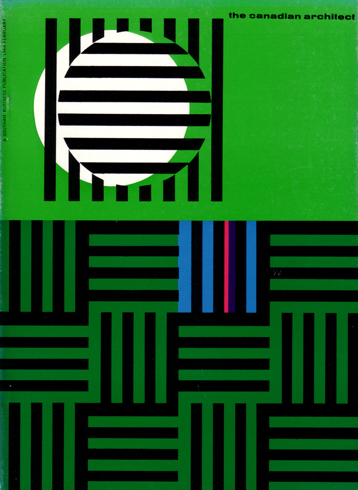
Bold green fields and hard-edged black bars announce the February 1966 cover of *The Canadian Architect* with the confidence of mid-century modern graphic design. A white circle—partially veiled by horizontal stripes—sits like an abstract sun or lens, turning simple geometry into a sense of depth and motion. Even before a reader reaches the articles, the cover art signals a profession fascinated by order, rhythm, and the clean logic of the grid.
Across the lower portion, interlocking bands form a woven, architectural pattern that feels both decorative and structural, like a plan view translated into pure graphic language. Narrow accents of blue and a thin red line interrupt the monochrome bars, adding just enough contrast to suggest systems, circulation, or the pulse of a modern city. The overall composition plays with figure and ground, inviting the eye to “read” it the way one reads a façade: repeating elements, measured intervals, and deliberate interruptions.
For anyone researching Canadian architecture publications or the visual culture of the 1960s, this cover is a compact time capsule of design priorities and printing aesthetics. It works equally well as inspiration for contemporary layout, branding, or poster design, showing how much atmosphere can be built from rectangles, stripes, and a single circle. Filed under “Cover Art,” it stands as a reminder that architectural discourse has long been framed not only by buildings, but also by the striking graphics that introduced them.