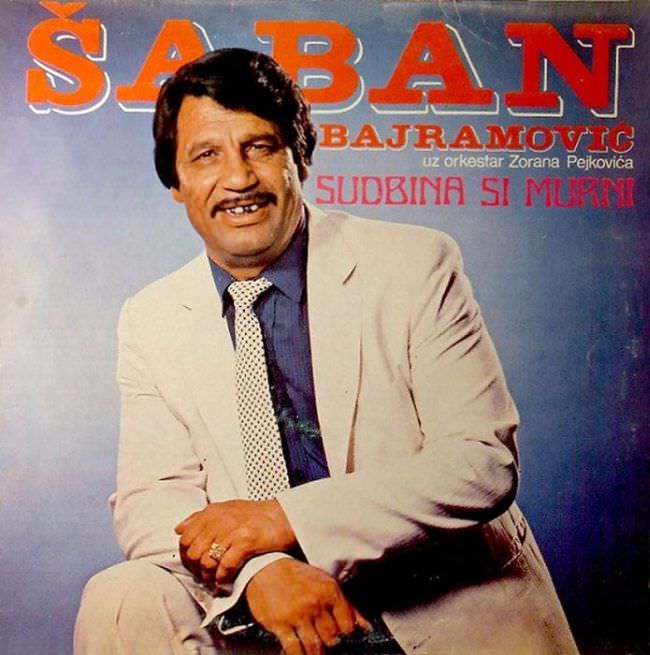
Oversized lettering shouts the performer’s name across a hazy studio backdrop, while a neatly posed singer in a light suit smiles straight at the viewer. The design leans hard on contrast—warm reds and oranges above, cool blues behind—creating that unmistakable Yugoslav record-shelf look where typography did the heavy lifting. Even without knowing the exact year, the polished hair, patterned tie, and formal stance place it firmly in the late-20th-century pop-folk marketing world.
Beneath the bold headline, smaller lines of text stack up in a pragmatic way, mixing the artist’s identity with production credits and the album title “Sudbina si moja.” It’s an approach that feels less like “concept art” and more like a printed announcement: clear, direct, and optimized for instant recognition in a shop bin. The slight wear, soft focus, and uneven color reproduction—common in mass-printed sleeves—only deepen the period authenticity and hint at the budget realities behind much 1970s and 1980s Yugoslav album cover design.
What makes this cover art so revealing is how it balances aspiration and constraint: a carefully dressed star framed by simple studio photography, topped with attention-grabbing type meant to travel well on cassette, LP, or poster. For anyone researching Yugoslavian album art, Balkan cover aesthetics, or the visual culture of socialist-era entertainment markets, it’s a compact lesson in how image, text, and status were packaged together. The result can read as awkward or “ugly” by today’s standards, yet it remains a vivid snapshot of how music was sold—loudly, proudly, and with little patience for subtlety.