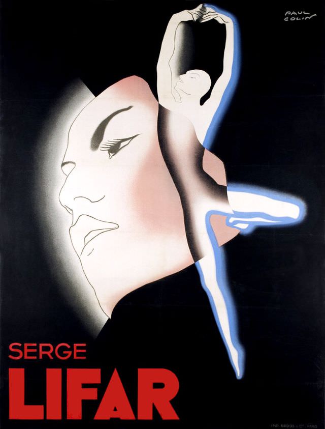
Against a deep, theatrical black, a stylized dancer rises in a clean, vertical line—arms arched overhead, one leg extended in a poised balance—while a softly shaded profile floats behind like a stage mask or dream. The bold red lettering “SERGE LIFAR” anchors the composition, giving the piece the unmistakable feel of 1930s cover art designed to be seen from across a lobby. In the corner, the artist’s signature “Paul Colin” appears, tying the image to the era’s celebrated graphic design language.
The poster’s power lies in its economy: sharp silhouettes, airbrushed gradients, and a cool halo of blue-white outlining the dancer’s body, all suggesting motion without clutter. The oversized face—serene, introspective, and glamorous—creates a dialogue between performer and persona, as if ballet technique and public image are inseparable. With minimal elements and dramatic contrast, the design translates dance into pure modernist geometry and light.
Presented under the title “Serge Lifar, 1935,” this historical print reads as both advertisement and artwork, capturing how ballet stars were marketed through striking illustration. It’s an excellent visual reference for anyone researching Serge Lifar, interwar performing arts, or Art Deco poster aesthetics, where typography and figure drawing work together to build myth. As a WordPress feature, it offers rich detail for collectors and historians alike, from the graphic composition to the period branding that made stage culture feel contemporary and daring.