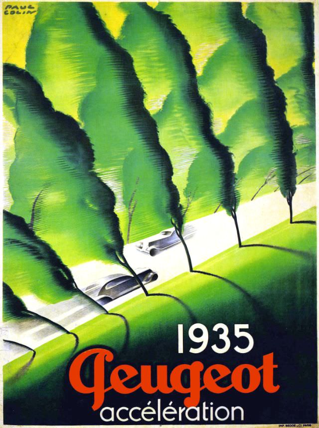
A rush of green hills and tapered trees frames a pale ribbon of road, where two streamlined cars slip through the landscape like quiet bullets. The composition exaggerates speed by compressing the curves and tilting the perspective, turning a simple drive into a visual sprint. Bold typography anchors the scene with “1935 Peugeot accélération,” pairing modern lettering with an unmistakably Art Deco sense of motion.
Set against the optimism and anxiety of the interwar years, this cover art leans into the era’s fascination with aerodynamics, engineering, and the promise of personal mobility. The cars are rendered with glossy, simplified forms—less portraiture than symbol—suggesting efficiency and refinement rather than brute power. Even the repeated tree trunks become a rhythmic blur, a graphic device that mimics what the eye sees when acceleration takes over.
For collectors of vintage automobile advertising and fans of French graphic design, “Peugeot accélération, 1935” works as both a historical document and a striking decorative print. Its saturated greens, strong diagonals, and minimal detail make it instantly legible in a thumbnail while rewarding a closer look with careful shading and brushwork. As a WordPress feature image, it offers excellent SEO potential around Peugeot history, 1930s car culture, and classic poster art from the Art Deco period.