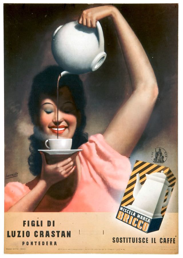
A smiling woman in a rose-pink dress lifts a white pot high overhead, letting a thin stream of dark liquid fall neatly into a waiting cup and saucer. The composition feels like classic Italian advertising art: idealized features, soft airbrushed shadows, and a theatrical gesture that turns a simple pour into a moment of glamour. On the right, the product box—framed by bold diagonal stripes—anchors the scene and keeps the message unmistakably commercial.
The title text, “Miscela Marca Bricco, Sostituisce il Caffè,” points to a coffee substitute, a revealing detail for 1939 and the era’s changing consumer landscape. Even without naming ingredients, the poster’s promise is clear: warmth, aroma, and routine can be maintained when real coffee is scarce or expensive. The branding elements and the proud placement of the package make this a useful example of how Italian print advertising mixed aspiration with practicality.
At the bottom, additional lettering includes “Figli di Luzio Crastan” and “Pontedera,” grounding the artwork in an Italian business identity while keeping the focus on the product claim. For collectors and historians, this piece works on two levels—graphic design with strong color contrasts and period typography, and a snapshot of everyday habits reframed by marketing. It’s an evocative vintage Italian poster for coffee culture, substitution, and the persuasive power of illustration.