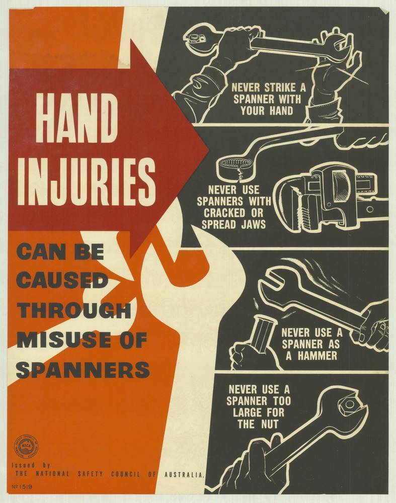
Bold blocks of orange and black frame a blunt warning: “HAND INJURIES can be caused through misuse of spanners.” The design leans on a big arrow and high-contrast typography to stop the viewer in their tracks, a hallmark of 1970s safety messaging where clarity mattered more than subtlety. Issued by the National Safety Council of Australia, the poster reads like a visual shout—simple, direct, and meant to be understood at a glance in a workshop or on a factory wall.
Along the right-hand side, a sequence of line drawings breaks the lesson into unmistakable do’s and don’ts: never strike a spanner with your hand, never use spanners with cracked or spread jaws, never use a spanner as a hammer, and never choose one that’s too large for the nut. Each panel isolates a risky habit and pairs it with the correct grip or tool choice, turning common shortcuts into teachable moments. The pared-back illustrations make the hazards legible even from a distance, reinforcing how workplace safety posters functioned as everyday training aids.
Mid-century and 1970s industrial poster art often balanced authority with practicality, and this example shows that mix perfectly—technical advice delivered with graphic confidence. For anyone researching Australian occupational health and safety history, the National Safety Council’s poster campaigns reveal how prevention was communicated before today’s digital inductions and signage standards. As cover art, it serves as both a period piece and a reminder that small tool choices can have big consequences for hands, work, and wellbeing.