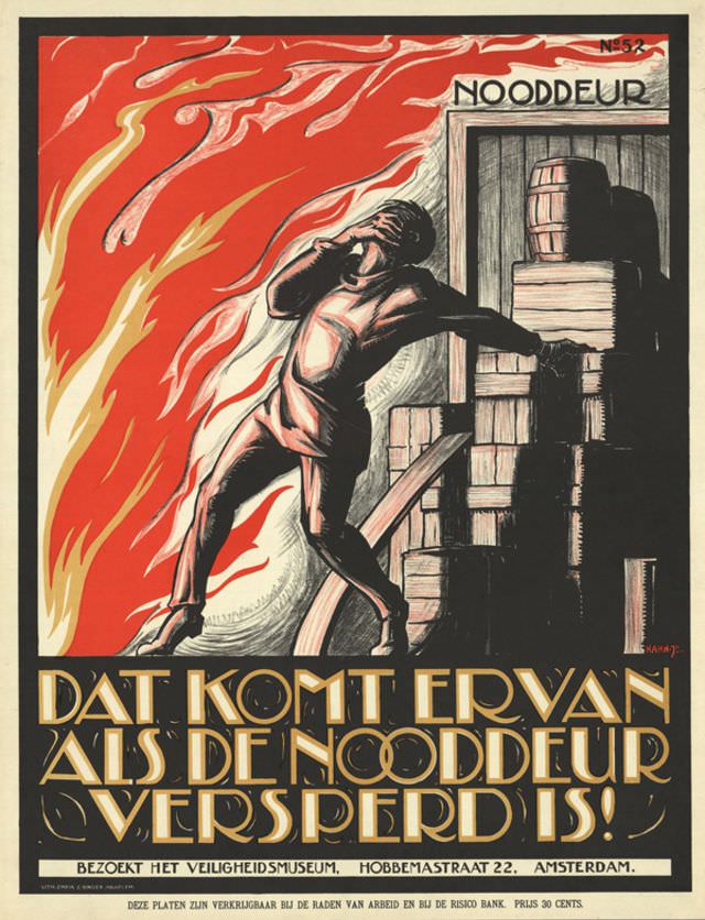
Flames lick across a vivid red sky while a lone worker recoils in panic, one arm thrown up to shield his face and the other braced against a heap of crates and barrels. Above the stacked goods sits the stark label “NOODDEUR,” turning a simple doorway into the poster’s central warning. Rendered in dramatic contrasts and sharp angles, Albert Hahn’s design (1926–1927) uses urgency and motion to make danger feel immediate.
The bold Dutch slogan—“DAT KOMT ER VAN ALS DE NOODDEUR VERSPERD IS!”—drives the message home: catastrophe follows when an emergency exit is blocked. Heavy black shadows, stylized smoke, and the cramped storage scene suggest how quickly order can become a trap, especially in industrial or warehouse settings. Even without knowing the exact incident behind it, the composition reads as a forceful public-safety appeal meant to be understood at a glance.
At the bottom, the call to “BEZOEKT HET VEILIGHEIDSMUSEUM” situates the print within a wider culture of safety education and prevention, pointing viewers toward a museum in Amsterdam for guidance and instruction. As a piece of early 20th-century graphic design, the poster merges art and civic responsibility, showing how illustrated propaganda could shape workplace behavior. For readers interested in Albert Hahn, Dutch poster art, or the history of fire safety and emergency exits, this striking print remains a memorable lesson in the power of visual warning.