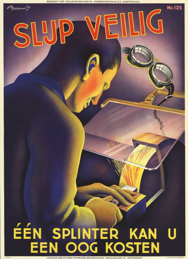
Bold lettering shouts “SLIJP VEILIG” across Hans Bolleman’s 1942 safety poster, immediately framing the scene as a warning as much as an artwork. A worker leans in toward a grinding wheel, hands steady at the tool rest, while sparks flare and scatter in sharp, painterly strokes. The spotlight-like lamp above and the curved protective shield create a dramatic industrial stage, turning an everyday workshop moment into a memorable lesson.
Dutch text at the bottom—“ÉÉN SPLINTER KAN U EEN OOG KOSTEN”—drives home the central message: one splinter can cost an eye. Bolleman’s composition places the viewer uncomfortably close to the hazard, making the flying fragments feel imminent and real. Even without showing explicit injury, the poster communicates urgency through contrast, glow, and the tight focus on the worker’s face and hands.
As a piece of wartime-era graphic design, this poster sits at the intersection of public instruction and modern illustration, using clarity and impact to influence behavior. The typography, saturated color gradients, and simplified forms reflect how mid-20th-century posters balanced aesthetics with workplace safety messaging. For collectors, historians, and anyone interested in occupational safety history, “Poster by Hans Bolleman, 1942” remains a striking example of how art was used to promote safer practices in industrial settings.