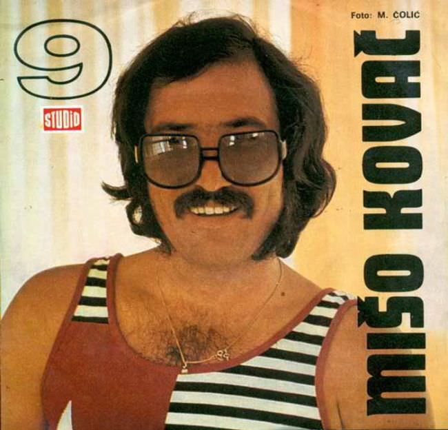
A mustachioed singer stares out through oversized square glasses, smiling with the unguarded confidence of a studio portrait meant to sell a personality as much as a record. The tank top—half solid color, half nautical stripes—reads like a design compromise made at the last second, yet it’s exactly the sort of awkward boldness that defines much Yugoslav album cover art from the 1970s and 1980s. Even the background feels utilitarian, pushing the face forward as the main “brand,” with little attempt at mood beyond a warm, slightly faded palette.
Typography does the heavy lifting here, with the artist’s name stacked vertically in thick, blocky letters that shout more than they sing. A small “Foto:” credit sits near the top, and the “Studio” mark adds a whiff of institutional polish, but the overall effect is a collision of earnestness and cheap print aesthetics. It’s the uncomfortable truth behind a lot of regional cover art from the era: limited budgets, fast turnaround, and graphic choices that now look unintentionally comic—yet unmistakably of their time.
For anyone researching Yugoslavian cover design, this kind of sleeve is a perfect case study in how pop culture traveled through constraints: simple lighting, direct posing, and a layout that prioritizes legibility over artistry. What looks “ugly” today also functions as an archive of everyday taste—hair, eyewear, wardrobe, and the visual language of local record labels trying to keep pace with global trends. Taken together, the image and title invite a closer look at why these covers were made the way they were, and why their odd charm keeps resurfacing in discussions of retro graphic design and Balkan music history.