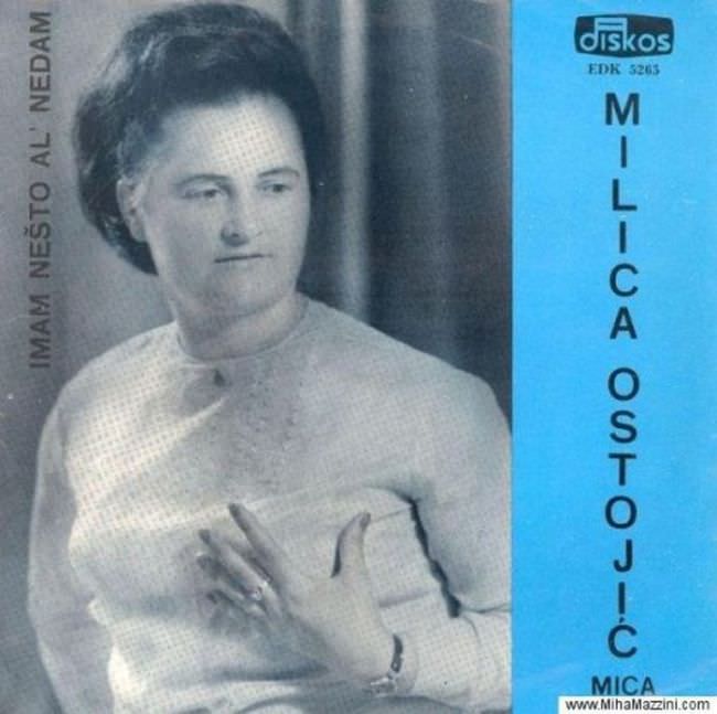
Front and center on this Yugoslav-era record sleeve, a studio portrait is paired with stark typography, creating the kind of uneasy balance between intimacy and marketing that defined plenty of 1970s and 1980s album cover art. The grayscale photo leans soft and formal—posed hands, careful hair, a neutral expression—while the layout pushes the performer’s name into tall, vertical lettering that demands attention more than it offers warmth. A bold blue side panel adds a jolt of color that feels less like artistic confidence and more like a practical, print-friendly solution.
Look closer and you can almost hear the compromises: limited budgets, quick turnarounds, and design choices guided by what presses and paper could reliably deliver. The branding mark “Diskos” sits at the top, with catalog-style text nearby, emphasizing the product side of music culture just as much as the person on the cover. Even the title text—set along the left edge—reads like an afterthought, squeezed into the margins rather than integrated into a cohesive visual story.
What makes this kind of Yugoslavian album art fascinating is precisely what can feel “ugly” about it: the blunt framing, the clashing priorities, and the way mass production shows through the design. For collectors and visual historians, sleeves like this are more than mere cover art; they’re artifacts of a regional music industry navigating modernity with uneven tools. In that tension—between portraiture and packaging, aspiration and constraint—lies the real truth of how an era looked when it tried to sell sound through ink and paper.