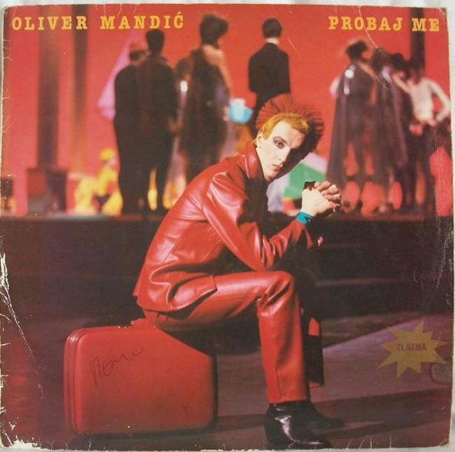
Red dominates the sleeve like a warning light, from the lacquered jacket and matching trousers to the saturated, stage-like background. The seated figure poses on a suitcase, angled toward the viewer with a stylized stare that leans into glam-rock theatricality rather than naturalism. Across the top, the typography is blunt and direct—“OLIVER MANDIĆ” on the left and “PROBAJ ME” on the right—announcing artist and title with the kind of no-nonsense confidence typical of Yugoslavian album cover art from the late 20th century.
Behind the foreground performance, blurred silhouettes gather in dark suits, giving the scene a fashionable yet oddly detached social energy. The contrast between the sharp, hyper-present subject and the indistinct crowd amplifies the cover’s uneasy mood: part nightclub, part photo studio, part propaganda-poster color palette. Even the worn corners and surface scuffs feel revealing, reminding us that these records were handled, traded, and played—mass culture artifacts that aged in real homes, not protected galleries.
Looking at it today helps explain the “ugly truth” hinted at in the post title: much of 1970s and 1980s Yugoslavian cover art chased modernity with limited means, resulting in designs that could be simultaneously bold, awkward, and unforgettable. The heavy color grading, the posed masculinity, and the theatrical styling point to a music industry trying to look international while remaining rooted in local aesthetics and printing realities. For collectors and design historians, this kind of cover is valuable not because it is “beautiful,” but because it documents how a whole era packaged sound into image—and how taste, technology, and ambition collided on a single square of cardboard.