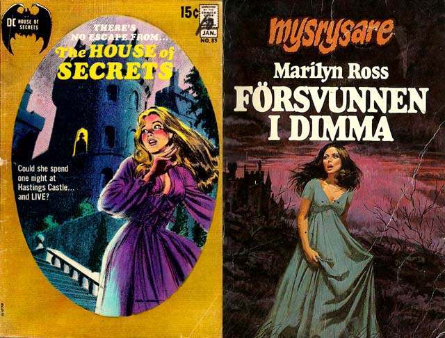
Pulp-era gothic romance cover art thrives on the moment just before the scream, and these two examples lean hard into that charged pause. On one cover, a blonde heroine in a purple dress recoils beneath the looming silhouette of a castle, the text teasing danger and confinement with “The House of Secrets” and a breathless promise of no escape. On the other, a woman in a pale blue gown stands in a dark, wind-swept landscape under an ominous sky, framed by Scandinavian lettering that adds an extra layer of mystery for modern viewers.
What makes the “woman running from the house” motif so psychologically sticky is how it compresses an entire story into a single, legible symbol: the home turned predatory. The architecture is exaggerated into a presence—towering, shadowed, and watchful—while the heroine’s flowing hair and billowing fabric suggest movement even when she’s frozen in paint. That contrast between rigid stone and vulnerable motion becomes the hook, inviting readers to project fear, curiosity, and desire onto the same threshold.
Viewed today, these covers double as cultural artifacts, revealing how mid-century publishing sold suspense through atmosphere as much as plot. Color choices, typography, and theatrical lighting all work together to signal gothic romance at a glance, making the image instantly searchable for collectors interested in vintage paperback cover art, pulp illustration, and genre history. Whether you’re drawn to the melodrama or the design craft, the recurring flight from the haunted house remains a potent visual shorthand for secrets that refuse to stay buried.