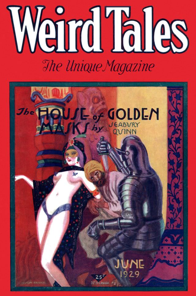
Bold crimson framing and oversized lettering announce *Weird Tales* with the confidence of a magazine that knew exactly how to stop a passerby at the newsstand. The June 1929 cover leans into spectacle: the subtitle “The Unique Magazine” hovers beneath the masthead, while a dramatic central scene pulls the eye inward. Even the pricing and date, tucked near the bottom alongside “June 1929,” become part of the sales pitch—an invitation to step into lurid, imaginative fiction.
At the center, cover art credited in the corner to Hugh Rankin stages a tableau of peril and glamour, with a scantily clad woman posed against richly colored architectural backdrops. An armored figure presses close, and a shadowed, turbaned onlooker heightens the tension, creating the kind of theatrical menace that pulp fantasy and horror thrived on. Across the artwork, the story title “The House of Golden Jars” and the author name “Seabury Quinn” are integrated into the scene, blending typography with illustration in a way that feels both promotional and immersive.
Collectors and historians often return to covers like this because they preserve more than a single issue—they capture the era’s visual language of sensationalism, exoticism, and high-stakes adventure. As a piece of 1920s pulp magazine cover art, it speaks to how *Weird Tales* marketed strange fiction through vivid color, provocative composition, and a promise of uncanny thrills. For anyone exploring *Weird Tales* history, June 1929 offers a striking example of how cover design shaped the magazine’s legend and helped define early fantasy and horror publishing.