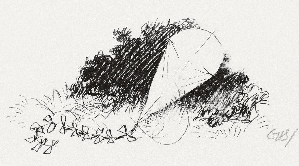
A brisk line of pen and ink turns the “Wind on the Hill” into something you can almost hear, with hurried strokes massing into dark shrubs and a pale, sloping rise left deliberately open. Across the foreground, a string of small bow-like forms—suggesting bent stems, seedheads, or a tossed garland—skitters along the ground as if pushed by an unseen gust. The composition is spare but lively, using contrast and negative space to evoke movement rather than spell out every detail.
As a tailpiece illustration, this small artwork does the quiet work of closing a page while keeping the poem’s mood in motion. Instead of presenting a character or a fixed scene, it offers a shorthand landscape: wind-swept vegetation, quick scribbles for grass, and a hillside that feels both sheltering and exposed. That restraint is part of the charm, inviting readers to supply the sound and chill of the air from A. A. Milne’s words.
Collectors and literary history enthusiasts will recognize how such book illustrations shaped the reading experience, especially in classic children’s poetry and early twentieth-century publishing. The drawing’s economy—just enough marks to suggest weather, place, and pace—makes it an appealing example of period pen-and-ink illustration and print design. For anyone searching A. A. Milne “Wind on the Hill” artwork, tailpiece illustrations, or classic book illustration details, this image offers a succinct visual echo of the poem’s famous, elusive wind.