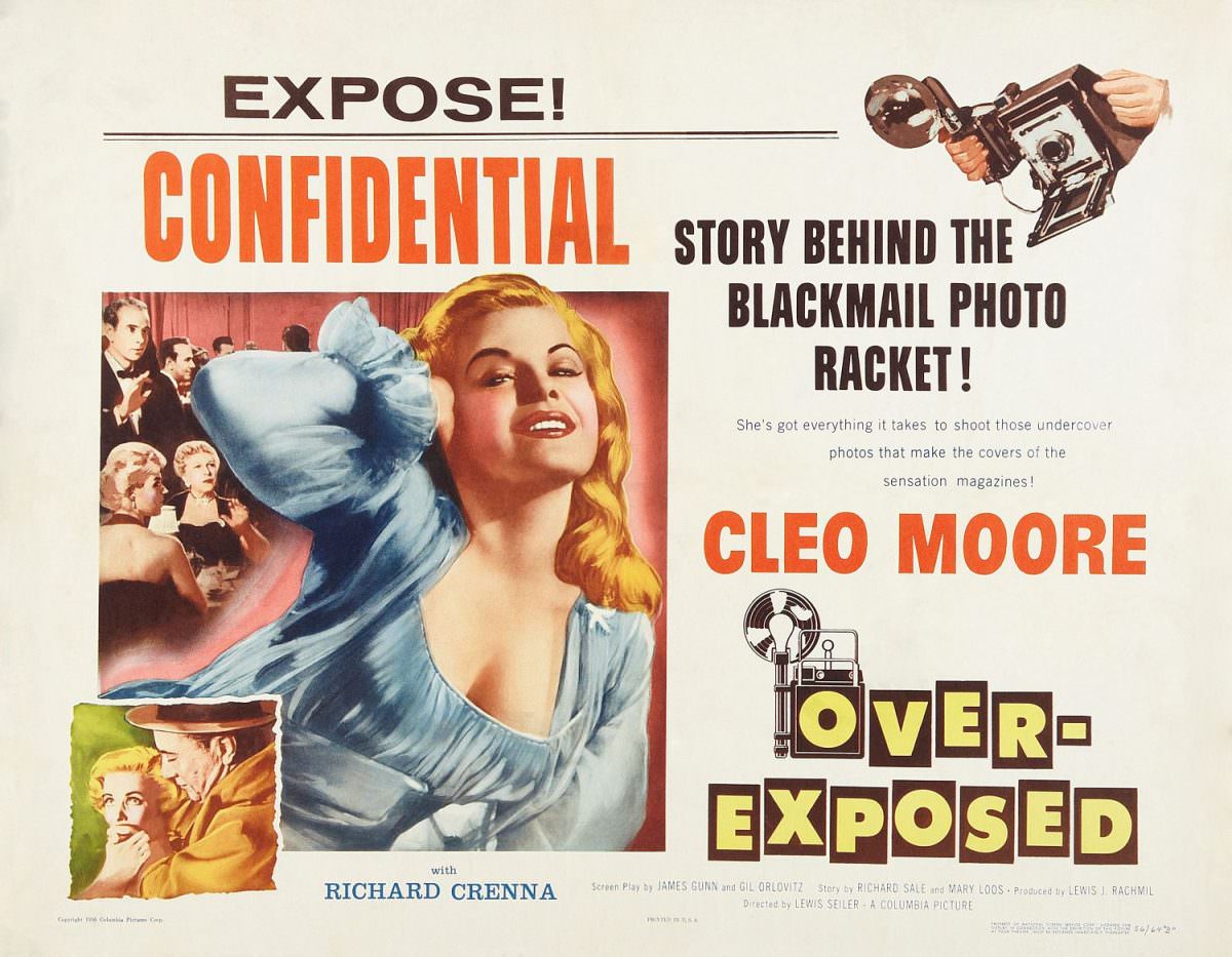
Bold tabloid typography—“EXPOSE!” and “CONFIDENTIAL”—sets the tone for *Over-Exposed (1956)*, a piece of cover art that practically shouts from the newsstand. The composition centers on a glamorous blonde in a pale blue dress, posed with an easy confidence while scenes of nightlife and hushed encounters play out in smaller vignettes beside her. A looming camera graphic and the phrase “blackmail photo racket” lean hard into mid-century anxieties about surveillance, scandal, and the power of a well-timed snapshot.
Color and design do the heavy lifting here, mixing creamy negative space with punchy reds, oranges, and ink-black lettering to create instant drama. The illustrated figures feel like a staged moment caught between flashbulbs—part Hollywood sheen, part pulp menace—while the blocky “OVER-EXPOSED” title turns the language of photography into a moral warning. Even without context beyond the poster itself, the artwork sells a story about secrets, temptation, and the dangerous business of images.
Collectors and film-history readers will recognize why this kind of 1950s cover art remains so searchable and shareable: it’s a capsule of period marketing, graphic design, and social mood all in one frame. For a WordPress archive focused on vintage movie posters, crime melodrama aesthetics, or the visual culture of scandal, *Over-Exposed (1956)* offers strong SEO appeal through its bold copy, camera motif, and sensational narrative hook. Look closely and you can almost hear the implied whisper behind every headline—proof that, in this era, being “over-exposed” meant far more than a technical mistake.