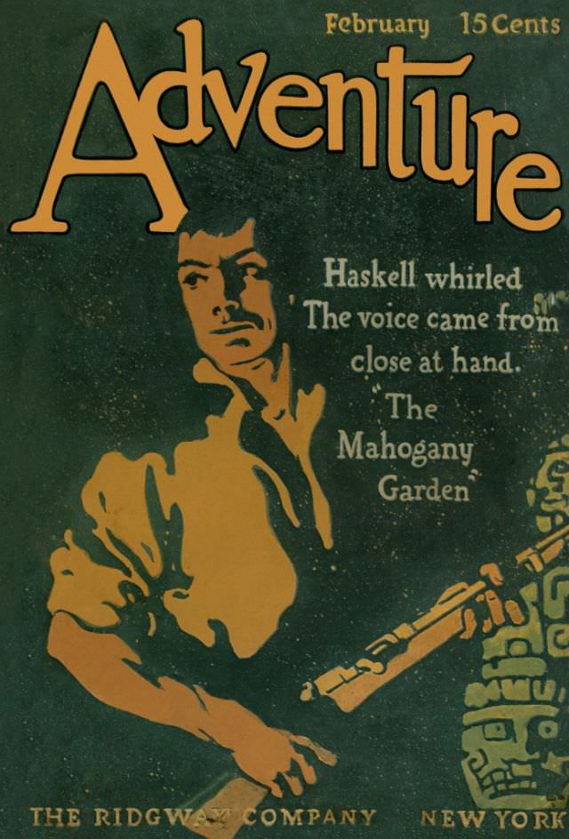
Bold lettering spells “Adventure” across the top of this February issue, priced at 15 cents, with the month printed neatly in the corner. The cover art is rendered in a limited palette—warm gold against deep green—giving it the graphic punch of early 20th-century magazine design. At the bottom, the imprint “The Ridgway Company” and “New York” anchors the piece in the world of mass-circulation publishing.
A tense, cinematic figure dominates the scene: a man in a loose shirt turns as if startled, his posture caught mid-motion. Nearby, a rifle and the hint of another patterned form at the edge suggest danger just outside the frame, the sort of cliffhanger imagery that pulp readers expected at the newsstand. The dramatic shadows and simplified shapes feel like poster art, built to be read instantly from a distance.
Text on the cover teases the story within—“Haskell whirled… The voice came from close at hand… ‘The Mahogany Garden’”—offering a fragment that invites curiosity without giving away the plot. For collectors and historians of pulp magazines, this “Adventure” cover from February 1911 is a crisp example of how illustration, typography, and suspenseful copy worked together to sell a promise of action. As a piece of cover art, it captures the era’s appetite for serialized thrills and the visual language that made adventure fiction a staple of popular culture.