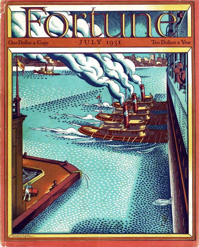
Bold Art Deco lettering crowns the July 1931 cover of *Fortune* magazine, framing a bustling waterfront rendered in crisp, graphic color. The scene looks down a narrow channel where steam-powered tugboats churn the water into patterned wakes, their funnels stacking thick plumes of smoke that arc across the sky. Along the margins, dock walls and industrial structures hem in the view, turning the harbor into a stage for movement, labor, and machinery.
The illustration leans into the era’s fascination with modern industry—metal hulls, rhythmic waves, and engineered power expressed with almost poster-like precision. Small human figures are present but secondary, emphasizing scale: people appear as tiny accents against the mass of ships and the geometry of the port. Even the water is stylized, dotted and textured to suggest both sparkle and strain, as if commerce itself has a visible surface.
Details printed at the top—“One Dollar a Copy” and “Ten Dollars a Year”—root the artwork in the magazine’s premium identity and its audience of business-minded readers. Seen today, this *Fortune* cover art offers more than design nostalgia; it’s a window into how early-1930s publishing visualized progress, trade, and the infrastructure of a modern economy. For collectors of vintage magazine covers and historians of graphic design, it remains a striking example of illustrated editorial art from the period.