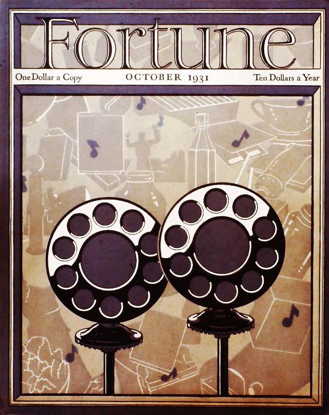
Bold typography crowns the October 1931 cover of *Fortune*, with period pricing—“One Dollar a Copy” and “Ten Dollars a Year”—framing the magazine as both premium product and modern guide. Below the masthead, the artwork leans into the sleek visual language of early 20th-century design: crisp outlines, a warm muted palette, and a composition that feels engineered as much as illustrated.
Two oversized rotary-style telephone dials dominate the foreground, rendered like monumental machinery, while the background dissolves into a collage of schematic lines, instruments, and floating musical notes. The effect is part blueprint, part advertisement, suggesting a world where communication, industry, and entertainment are converging into a single, wired system. It’s an arresting snapshot of how mass media imagined the “new” technologies of the day—confident, rhythmic, and increasingly interconnected.
Seen now, this *Fortune* magazine cover offers more than cover art; it’s a window into the magazine’s early identity as a curator of modern business culture and industrial aesthetics. For collectors of vintage magazine covers, graphic design history enthusiasts, or anyone exploring 1930s visual culture, the October 1931 issue stands out for its celebration of networks—phones, signals, and the invisible currents that were reshaping everyday life.