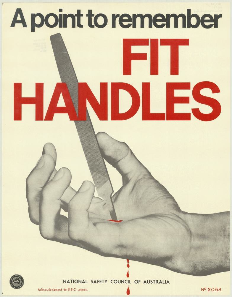
Bold typography does most of the talking here: “A point to remember” sits above the urgent command “FIT HANDLES,” set in large red letters that feel impossible to ignore. Below, a close-up of a hand steadies a metal file or blade-like tool, its sharp edge poised where a handle ought to be—an arresting moment that makes the safety message instantly clear. A small streak of red at the contact point and a falling drop underline the consequences of careless equipment, using minimal color for maximum impact.
Designed for quick comprehension in workplaces and training rooms, this National Safety Council of Australia poster shows how 1970s safety communication leaned on strong contrast, simple staging, and a single memorable idea. The mix of photographic realism and graphic restraint turns an everyday task into a warning about tool maintenance, proper fittings, and the hidden hazards of improvised grips. Even without extra text, the visual metaphor of an unhandled tool becomes a lesson in preventing hand injuries before they happen.
At the bottom, the attribution to the National Safety Council of Australia anchors the piece within a broader campaign of public-facing industrial safety posters. For readers interested in Australian safety history, occupational health messaging, or vintage poster design, this “Fit Handles” cover art offers a compact example of how persuasive visuals were used to shape safer habits. It’s a reminder that prevention often begins with the smallest details—right down to the handle in your palm.