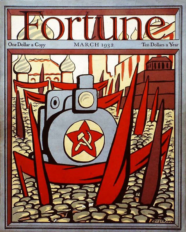
Bold lettering crowns the March 1932 cover of *Fortune*, with period pricing tucked neatly beneath the masthead—“One Dollar a Copy” and “Ten Dollars a Year”—a small reminder of how the magazine positioned itself in an era when money and industry were on everyone’s mind. The design is graphic and forceful, built from a tight palette of reds, creams, and slate blues, framed like a poster to command attention on a newsstand. Even before you read a single article, the cover art advertises confidence, modernity, and the magazine’s fascination with power.
At the center sits a stylized machine face—part industrial emblem, part looming presence—marked with a clear hammer-and-sickle inside a star. Jagged red forms thrust upward and inward like barricades, banners, or steel shards, while a dense field of rounded stones creates a textured ground that feels both constructed and besieged. In the background, simplified architecture with domes and blocky buildings adds atmosphere without pinning the scene to a specific named place, letting symbolism carry the narrative.
Seen today, this *Fortune* Magazine cover from March 1932 reads as a snapshot of how American business journalism packaged the world: dramatic, simplified, and charged with ideology. The composition turns geopolitics and industrial might into a single striking image, blending modernist illustration with the language of propaganda and anxiety. For collectors, designers, and readers interested in magazine history, vintage cover art, and early 1930s visual culture, it’s a compelling artifact of the period’s fears and fascinations.