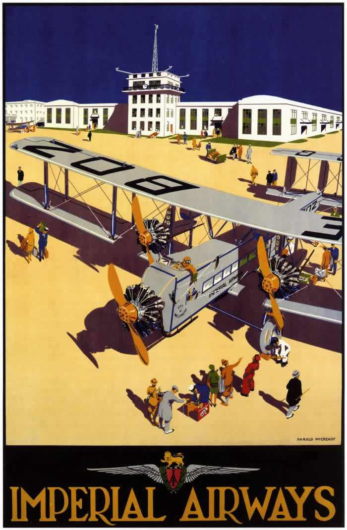
Bold blocks of color and crisp geometry announce an era when flight still felt like a grand public event, and Imperial Airways knew how to sell that feeling. On the cover art, a large biplane dominates the foreground as passengers and onlookers gather across a sunlit apron, their long shadows stretching toward the viewer. Behind them, an air terminal with a control tower stands like a modern civic monument, suggesting order, reliability, and the thrill of new technology.
Rather than focusing on a single traveler’s story, the composition celebrates the whole choreography of early air travel—ground crew at work, luggage being handled, and a crowd watching the aircraft as if it were a spectacle. The aircraft’s twin engines and prominent wingspan are rendered with poster-perfect clarity, turning machinery into an icon of progress. Even the simplified figures and architectural lines carry the unmistakable language of interwar advertising: clean, confident, and designed to make speed and safety look effortless.
Imperial Airways posters from the 1920s and 1930s helped transform aviation from daring experiment to desirable routine, and this design captures that transition in one glance. It’s an inviting window into how airlines built trust through visual storytelling—promising comfort, coordination, and a new kind of mobility that connected distant places through scheduled routes. For collectors, historians, and design lovers alike, the artwork stands as both travel marketing and cultural document, reflecting how the modern idea of commercial flight was imagined and sold to the public.