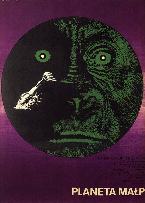
Eryk Lipiński’s 1969 cover art for “Planet of the Apes” leans into graphic minimalism with a bold, circular field that dominates the composition. A looming ape visage emerges from deep shadow in green-toned stippling, its wide, pale eyes fixed forward, creating an immediate sense of unease. Against the dark expanse, a tiny, bright figure evokes the Statue of Liberty, reduced to a stark emblem that hints at collapse and disorientation without spelling everything out.
Color does much of the storytelling here: a saturated purple border frames the central black disk like a portal, while the acid-green face feels both unnatural and inevitable. The scale contrast—monumental primate features versus the small human-made symbol—turns the poster into a visual thesis about power, inversion, and the fragility of civilization. The simplified shapes and limited palette reflect late-1960s poster design trends, where strong silhouettes and punchy color relationships carried cinematic ideas with spare, memorable force.
At the bottom, the Polish title “Planeta Małp” anchors the design in its international poster context, aligning film marketing with the era’s distinctive, illustrator-led graphic culture. For collectors and readers interested in “Planet of the Apes” memorabilia, this piece stands out as more than promotional material: it’s an interpretation, distilling the film’s themes into a single, unsettling icon. Whether viewed as sci‑fi cover art, classic movie poster design, or a snapshot of 1969 visual language, Lipiński’s image remains strikingly modern in how it invites the viewer to fill in the dread between symbol and shadow.