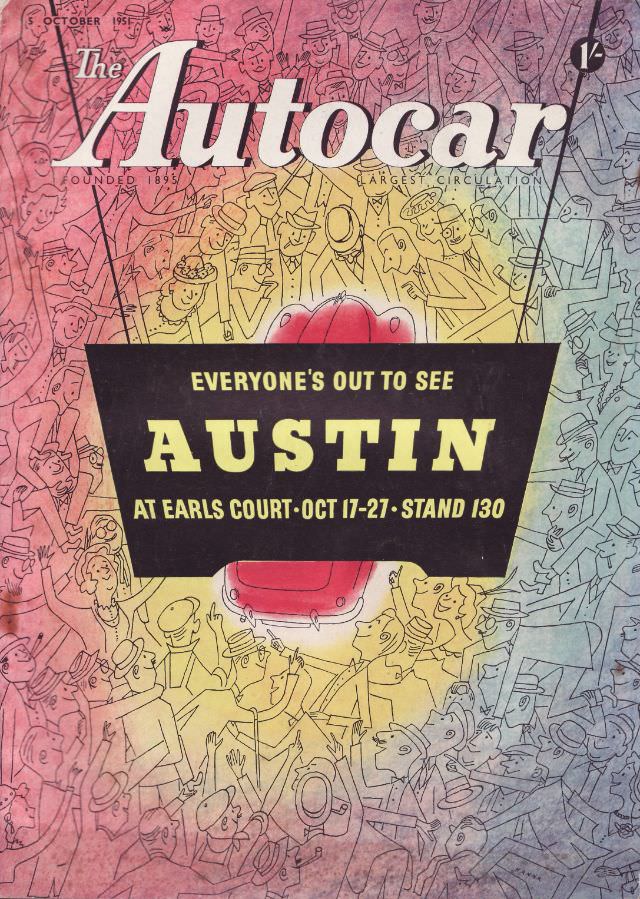
Across the top, the bold masthead “The Autocar” anchors an October 5, 1951 cover that feels both energetic and playful. The artwork is packed with cartoon-like faces and hats, a teeming crowd rendered in lively linework and washed with soft, shifting color tones that suggest movement and noise. Even without a single real photograph, the illustration conveys the excitement of a big motoring moment in postwar Britain.
At the center, a stark black panel delivers the message in large, confident type: “EVERYONE’S OUT TO SEE AUSTIN,” with a plug for Earls Court and specific show dates and stand number. Beneath the lettering, the rounded nose of a red car peeks through, turning the crowd into a kind of stage set around a new model reveal. It’s a classic piece of magazine cover design—simple hierarchy, high contrast, and a clear advertisement integrated into editorial identity.
Details like “Founded 1895” and “Largest Circulation” add period credibility, reminding readers that The Autocar magazine was positioning itself as an authoritative voice while still leaning into popular spectacle. For collectors and researchers, this 1951 Autocar cover is a tidy window into mid-century automotive marketing, car show culture, and the graphic sensibilities of the era. It also makes a striking WordPress feature image for posts about Austin history, Earls Court motor exhibitions, or classic British motoring ephemera.