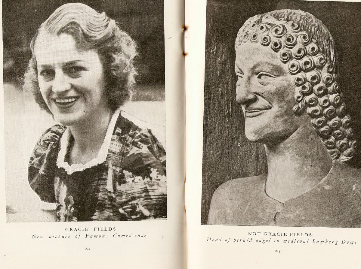
Across a two-page spread, the joke lands instantly: on the left, Gracie Fields smiles toward the camera in a candid, magazine-style portrait, while the right-hand page offers a carved head with an uncannily similar grin and profile. The printed captions do the heavy lifting—“Gracie Fields” versus “Not Gracie Fields”—turning a simple comparison into a bit of visual comedy that still works decades later. Even the crease of the binding and the slightly worn paper texture add to the charm, reminding us this was meant to be discovered while flipping pages.
Gracie Fields appears here as a familiar public face, presented as a “famous comedienne,” with soft lighting and a patterned outfit that reads as everyday glamour rather than studio stiffness. Opposite her, the sculpted figure is described as a “herald angel” from a medieval cathedral, its stylized curls and elongated nose giving it that instantly recognizable ecclesiastical look. The pairing plays on the human habit of spotting lookalikes everywhere—especially when a wide smile and a strong profile are involved.
Collectors of vintage ephemera and fans of classic entertainment will enjoy how this spread blends celebrity culture with medieval art in one neat, funny juxtaposition. It’s also a small reminder of how printed media once curated humor: a caption, a comparison, and the reader completes the punchline. For anyone searching Gracie Fields memorabilia, historical magazine pages, or quirky “celebrity lookalike” finds, this post preserves a delightful moment of visual wit.