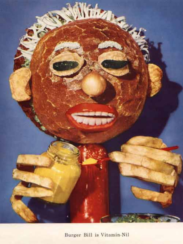
At first glance, the “healthy eating” message comes wrapped in something closer to a fever dream: a grinning mascot with a hamburger-like head, heavy-lidded eyes, and cartoon-red lips, posed as if it’s about to serve a wellness cure from a small jar. The colors are bold and deliberately unnatural, turning familiar foods into an unsettling character design that’s equal parts playful and grotesque. A caption at the bottom ties the figure directly to vitamin promotion, underscoring how mid-century nutrition campaigns often leaned on personified, attention-grabbing figures to make dietary advice feel memorable.
Mid-century American food culture loved mascots, but these vitamin characters push the idea into surreal territory, using exaggerated features and odd textures to sell an educational point. The hands look like stacks of pale bread or rolls, while the central “body” reads like a bright condiment bottle—props that blur the line between kitchen items and anatomy. That visual confusion is the hook: by making the message weird, the artwork practically forces the viewer to stop, stare, and remember the vitamin name it’s meant to imprint.
Beneath the bizarre charm sits a revealing snapshot of 1950s health messaging, when “eat right” could be packaged as entertainment as much as instruction. The piece also reflects the era’s fascination with new nutrition science and the marketing power of simplified characters—vitamins turned into personalities, food turned into slogans. For anyone exploring vintage advertising art, retro diet education, or the stranger corners of public-health promotion, this image is a vivid reminder that the past didn’t just teach nutrition—it staged it.