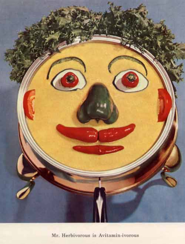
A grinning “face” assembled from pantry staples stares straight back at the viewer, equal parts playful and unsettling. Bright red slices become wide eyes, a dark vegetable forms a nose, and glossy peppers shape a mouth, all framed by the shiny rim of what looks like a pot lid or serving platter. A leafy crown—more salad than hair—completes the character, turning everyday ingredients into one of those bizarre 1950s vitamin mascots designed to make nutrition feel like a friendly companion.
Mid-century diet culture loved gimmicks, and these promotional artworks leaned hard into anthropomorphism: if vegetables could look human, then healthy eating might feel less like a chore. The styling is bold and graphic, with saturated color and a clean background that reads like an advertisement or educational poster. Beneath the figure, a short printed caption reinforces the message, blending humor with moral instruction about being “good” by eating greens.
For collectors of retro advertising, food history, and health propaganda, pieces like this are a fascinating window into how the era sold the idea of a “balanced diet.” The visual joke is memorable precisely because it’s a little hellish—an edible clown-mask that sticks in the mind long after you’ve scrolled past. Whether you see it as kitsch, art, or a cautionary tale about marketing, this strange vitamin-themed character remains a vivid reminder of how 1950s design tried to make nutrition irresistible.