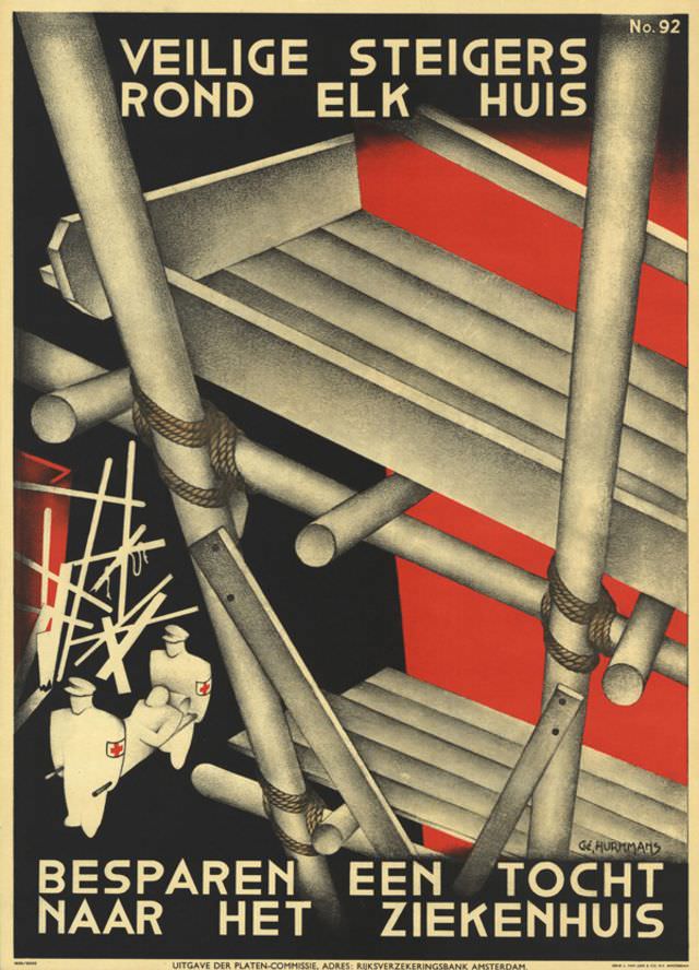
Bold Dutch lettering dominates the top—“VEILIGE STEIGERS ROND ELK HUIS”—setting an urgent, practical tone for Gé Hurkmans’s 1939 poster about safe scaffolding around every home. The design is all angles and compression: thick poles lash together with rope, platforms stack upward, and diagonal braces push the eye through a tight, industrial space. A limited palette of black, gray, and striking red turns construction materials into a graphic warning, making the message legible even at a glance.
Down in the lower left, small figures in white—marked with red-cross emblems—move toward a chaotic tangle that suggests a mishap waiting to happen. That contrast in scale is the poster’s quiet drama: towering scaffolding looms over people who would be left to deal with the consequences when safety fails. The bottom text, “BESPAREN EEN TOCHT NAAR HET ZIEKENHUIS,” drives the point home with blunt economy: prevent accidents and spare yourself a trip to the hospital.
Hurkmans’s approach feels unmistakably modern for the late 1930s, blending public-safety messaging with a crisp, almost architectural style that highlights structure, risk, and responsibility. For readers interested in historical posters, workplace safety history, or Dutch graphic design, this artwork offers a vivid example of how visual communication pushed prevention into everyday life. Even without a specific site named, the theme is universal—safe building practices as a form of social care, rendered with striking clarity.