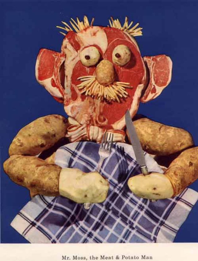
Gleaming against a bold blue background, a meat-faced character stares out with wide, uncanny eyes, a potato nose, and a bristly “mustache” that looks more like shredded garnish than hair. His head appears assembled from slices of cured meat and fat, while thick potato “arms” rest on a checkered cloth as he grips a fork and knife, poised for a meal that’s equal parts dinner-table and fever dream. The caption beneath identifies him as “Mr. Moss, the Meat & Potato Man,” underscoring how deliberately these food-based mascots were given personalities.
Mid-century nutrition messaging often leaned on friendly cartoons and simplified symbols, yet artworks like this reveal a stranger side of 1950s healthy-diet promotion. By turning everyday ingredients into a mascot, the image sells a message about hearty eating and “building” a body from the right foods, even as the design flirts with the grotesque. The theatrical staging—clean backdrop, centered figure, and props arranged like a formal place setting—suggests this was made to be memorable, even if it unsettles modern viewers.
Collectors of vintage advertising, nutrition ephemera, and oddball food art will find plenty to unpack in these hellish vitamin mascots and diet-themed creations. They sit at the crossroads of health education and spectacle, where shock value could be a feature rather than a flaw, ensuring the lesson stuck. As a piece of 1950s-era promotional artwork, “Mr. Moss” offers a vivid glimpse into how a “healthy diet” was marketed through humor, novelty, and a dash of the bizarre.