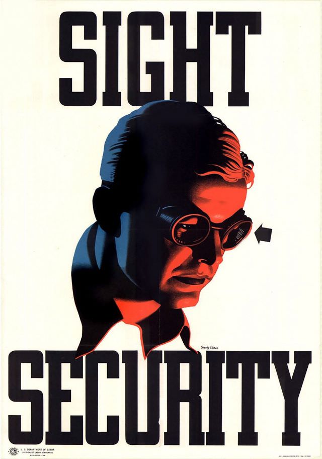
Bold typography dominates the design, pairing the towering words “SIGHT” and “SECURITY” with a dramatic, shadowed portrait of a worker wearing protective goggles. The limited palette—deep blacks, cool blues, and urgent reds—pulls the eye toward the face and the gleaming lenses, turning a practical message into striking wartime graphic art. Even the simple arrow pointing toward the goggles reinforces the idea that protection is not optional but essential.
Created during World War II and dated 1944 in the post title, the poster reflects how safety campaigns became part of the home-front effort, where factories and workshops were as vital as the battlefield. The emphasis on workplace eye safety speaks to the industrial hazards of wartime production—flying debris, sparks, and machinery—while framing injury prevention as a matter of national strength. In that context, “sight” becomes both a personal asset and a resource worth guarding.
For historians and design enthusiasts, this piece sits at the intersection of labor history, public health messaging, and wartime propaganda aesthetics. Its clean layout and commanding lettering make it instantly legible, while the stylized realism of the goggled worker gives it emotional weight and urgency. Whether you’re researching World War II posters, occupational safety history, or mid-century American graphic design, the image offers a compelling reminder that keeping workers safe was portrayed as part of keeping the nation secure.