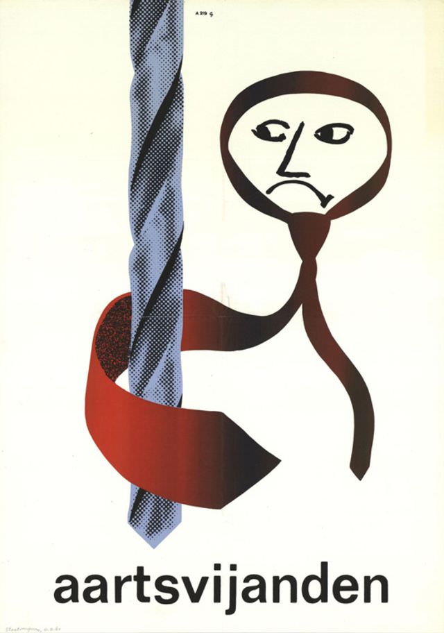
Bold, pared-back graphics give this mid-century artwork its punch: a stylized face drawn in thick, fluid lines hovers beside a tall, patterned form, while a sweeping red ribbon loops through the composition like a visual warning. The limited palette—black, red, and cool blue against an off-white ground—feels distinctly modernist, emphasizing contrast, silhouette, and gesture over detail. Below, the prominent word “aartsvijanden” anchors the design, reading like a headline and turning the image into a statement as much as an illustration.
Created sometime between 1959 and 1964 by an unknown designer, the piece reflects an era when poster art and printed ephemera leaned into abstraction to communicate quickly and memorably. The halftone texture in the vertical element hints at mass printing techniques, while the brush-like contours of the figure introduce a handmade urgency. That tension—mechanical dots versus expressive line—captures the look of a period in which graphic design experimented with both clarity and provocation.
For collectors and researchers of 20th-century graphic design, this historical image offers a compact lesson in how typography and symbol can work together to suggest mood, conflict, and narrative without spelling everything out. The ambiguous figure and looping ribbon invite interpretation, making it ideal for a WordPress post focused on artworks, political visual culture, or the evolution of modernist poster design. Even without a credited name, the design’s confidence and economy ensure it remains memorable—and searchable—for anyone exploring mid-century visual history.