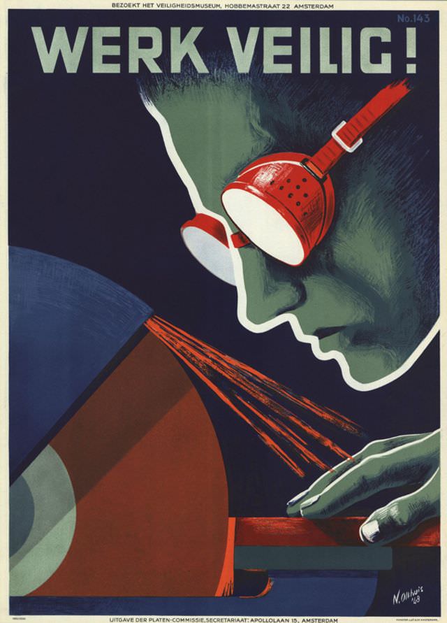
Bold letters shout “WERK VEILIG!” across the top of this striking 1950 poster by N. Olthuis, turning a simple safety message into something you can almost hear on a factory floor. A worker’s profile, rendered in cool greens and deep blues, leans toward a grinding wheel as bright sparks flare outward in sharp, orange strokes. The composition is graphic and urgent, using strong contrasts and simplified forms to make the warning instantly legible from a distance.
Protective goggles—painted in vivid red with bright reflections—become the visual anchor, reminding viewers that a small piece of equipment can stand between routine work and sudden injury. The poster’s mid-century design language is unmistakable: clean shapes, limited palette, and a cinematic close-up that pulls the viewer into the moment just before metal meets stone. Even without a caption beyond the headline, the image communicates risk, motion, and responsibility in a single glance.
Dutch text along the margins points to a broader campaign culture around workplace safety, suggesting this artwork belonged to an organized effort to educate and persuade. As a piece of historical graphic design, it sits at the intersection of industrial history, public messaging, and postwar visual culture, making it especially relevant for readers searching for mid-century posters, occupational safety art, or Dutch design ephemera. Olthuis’s poster endures because it treats prevention not as an abstract rule, but as a vivid, everyday decision made right at the machine.