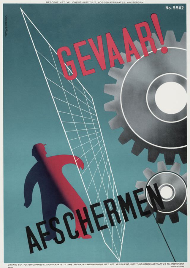
Bold typography and a limited palette give Jack de Rijk’s 1955 poster an immediate jolt of urgency, with the Dutch warning “GEVAAR!” (danger) cutting across the design in striking red. A cool blue-green field sets the stage for a clean, modern composition where sharp angles and large mechanical forms dominate the viewer’s attention. Even without narrative detail, the graphic language speaks plainly: hazards are real, and awareness must be instant.
At left, a simplified human figure appears caught near a slanted grid-like barrier, while a massive gear and circular industrial elements loom to the right. The word “AFSCHERMEN” (shield off / guard) anchors the message in practical action, suggesting that danger can be prevented through proper separation and protective measures. The poster’s use of scale—small worker, oversized machinery—reinforces the imbalance of power between people and moving equipment.
Mid-century safety posters like this one were designed to be read at a glance on factory walls and training corridors, marrying modernist aesthetics with public education. De Rijk’s layout turns workplace safety into a visual command, combining warning text, dynamic diagonals, and machine imagery into an unforgettable signal. For collectors of graphic design, industrial history, and Dutch poster art, this 1955 piece remains a crisp example of how typography and illustration were harnessed to promote safer working environments.