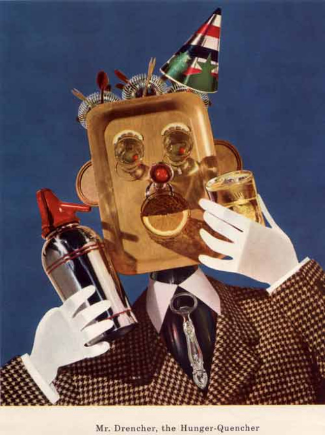
A party hat perches atop a face that looks more like a kitchen tray than a person, while bright, cut-out eyes and a red button nose turn nutrition into carnival theater. The artwork’s crisp colors and surreal collage style immediately signal mid-century advertising bravado, where “healthy living” could be sold with the same showmanship as a magic act. Even without a clear brand name, the visual language feels rooted in 1950s diet culture—cheerful, confident, and just a little unsettling.
Gloved hands hold up a glass and a metal dispenser, as if the character is about to serve a miracle tonic to the viewer. A lemon slice sits where a mouth should be, hinting at flavor, freshness, and the promise of vitamins packaged as performance. That tension—between wholesome messaging and bizarre mascot design—is exactly what makes these “hellish vitamin” promotions so memorable: they transform everyday health advice into something theatrical, odd, and strangely persuasive.
Fans of vintage nutrition ads, retro graphic design, and 1950s commercial art will find plenty to linger over in this post. The piece invites a closer look at how diet and wellness were marketed through exaggerated characters, playful props, and a wink of absurdity that still reads as modern. If you’re hunting for unusual healthy diet propaganda, creepy-cute mascots, and mid-century advertising ephemera, this image delivers a perfect dose of the era’s bright optimism—and its uncanny edge.