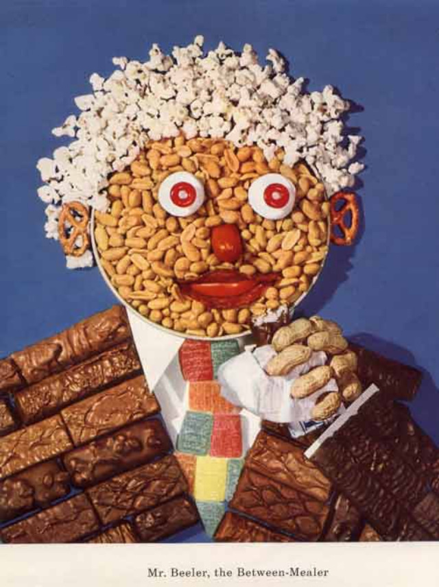
Bright, candy-colored surrealism turns nutrition into theater in these mid-century “vitamin mascots,” where a smiling face is assembled from snacks like a collage you can almost taste. Popcorn becomes hair, pretzels stand in for ears, and button-like candies form wide, unsettling eyes, all arranged against a clean, studio-blue backdrop. The effect is playful at first glance, yet oddly uncanny—exactly the kind of visual hook that made 1950s health messaging memorable.
At the bottom, the caption “Mr. Beeler, the Between-Meal-er” leans into rhyme and character branding, hinting at an era when dietary advice was often packaged as entertainment. Surrounding the figure are neat stacks of chocolate bars and a small pile of peanuts, suggesting the “between meal” theme and the temptations of snacking culture. Even without a specific brand named on the image, the composition reads like classic advertising art: simple background, bold color, and a central mascot designed to sell an idea as much as a product.
Browsing this post is a reminder that retro food art and historical advertising didn’t always take the sober route when promoting a “healthy diet.” Instead, marketers and illustrators reached for whimsical, sometimes hellish exaggeration—turning everyday treats into characters with big personalities and bigger eyes. For collectors, designers, and fans of vintage ephemera, these bizarre diet and vitamin-themed artworks offer a fascinating window into how the 1950s imagined nutrition, childhood appeal, and modern convenience all at once.