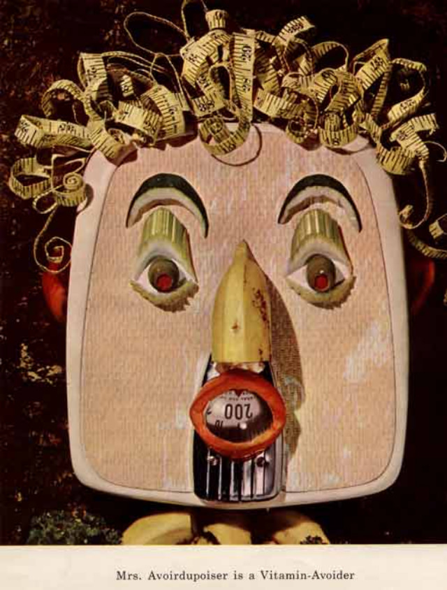
Oddly theatrical and a little unsettling, this mid-century artwork turns nutrition advice into a character study: a blocky, mask-like face framed by tight curls that resemble rolled paper or ribbon. The eyes are wide and off-kilter, the long nose drops toward a small, mechanical-looking mouth, and the whole composition leans into a carnival of discomfort rather than comfort. Beneath the image, a caption identifies the figure as “Mrs. Avoirdupoiser” and labels her a “Vitamin-Avoider,” pushing the viewer to read the portrait as a cautionary mascot rather than a person.
The design language feels rooted in 1950s health education and advertising, when bold visual gimmicks were often deployed to make diet and vitamins memorable for families, classrooms, and public campaigns. Instead of glossy optimism, the palette and exaggerated features suggest a “hellish” humor—an attempt to shame bad habits by making them grotesque, funny, and impossible to forget. Even the quirky, pseudo-French surname plays like a pun on weight and avoidance, reinforcing how moral judgment and body ideals seeped into messages about “healthy eating.”
For collectors and curious readers, pieces like this reveal how the era’s nutrition messaging blended art, satire, and anxiety into a single poster-ready character. The image works today as both vintage graphic design and cultural artifact, speaking to the rise of vitamin culture, fear-based persuasion, and the strange mascots that once promoted a healthy diet. If you’re researching 1950s diet propaganda, vintage health posters, or retro educational illustrations, this bizarre “Vitamin-Avoider” is a vivid example of how far campaigns would go to make nutrition feel urgent.