Category: Cover Art
Dive into a gallery of vintage cover art from books, magazines, and albums. Discover how graphic design and illustration reflected the moods of their times.
These covers capture the essence of cultural evolution — from bold propaganda to elegant minimalism.
-
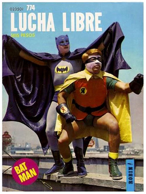
#8 Blood, Masks, and Glory: A Visual Tour Through Lucha Libre Magazine Covers of the 1970s #8 Cover Art
Lucha Libre magazine cover art from the 1970s had a flair for the outrageous, and this issue leans into it with full theatrical confidence. Under a bold “LUCHA LIBRE” masthead and a price marked “SEIS PESOS,” two costumed figures strike a rooftop pose against a hazy city skyline, turning the everyday urban horizon into a…
-
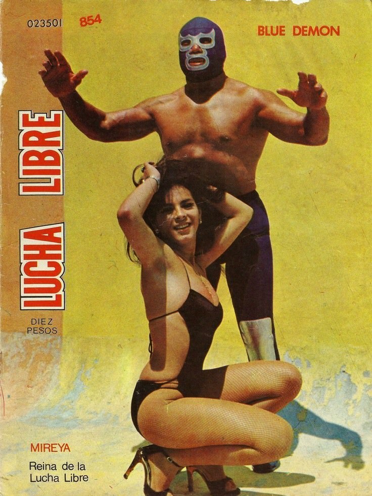
#24 Blood, Masks, and Glory: A Visual Tour Through Lucha Libre Magazine Covers of the 1970s #24 Cover Art
Lucha Libre erupts from this 1970s-era cover in bold blocks of color and attitude, with the masked wrestler “Blue Demon” towering against a sun-faded yellow background. The design leans into high drama: arms raised in a ready stance, the iconic mask rendered in deep blue and white, and the magazine’s vertical “LUCHA LIBRE” title screaming…
-
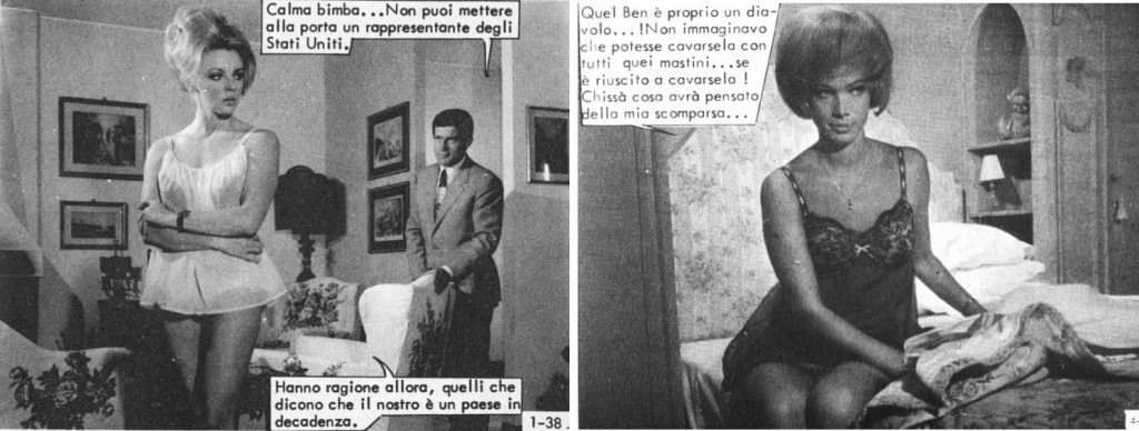
#2 The World of Spanish and Italian Crime Comics (Fotonovelas) from the 1960s-70s: Stories Told with Sensational Photogr
Glamour and danger collide in this striking slice of Italian-language fotonovela cover art, where staged photography does the work of inked panels. On the left, a tense domestic interior—framed pictures, heavy furniture, and a sharply dressed man in the background—sets up a classic crime-comic mood of suspicion and confrontation. The speech balloons, printed directly over…
-
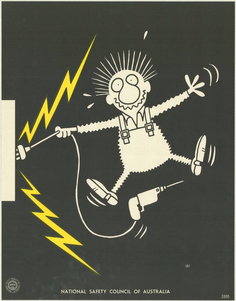
#6 National Safety Council of Australia Posters from the 1970s: Visual Messages for Keeping People Safe and Well
Bold cartoon drama does the talking on this cover art from the National Safety Council of Australia’s 1970s safety poster campaign. Against a deep black field, a wide-eyed worker in overalls flails mid-step as jagged yellow lightning bolts crackle nearby, turning a simple scene into an instant warning about electrical danger. The pared-back palette and…
-
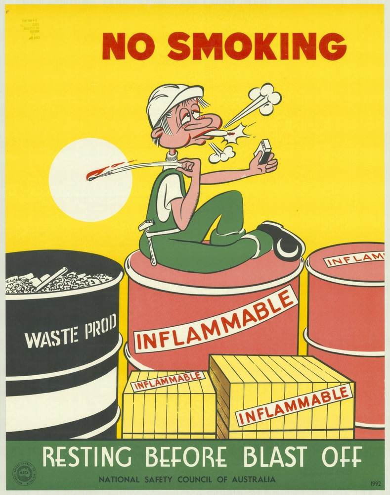
#22 National Safety Council of Australia Posters from the 1970s: Visual Messages for Keeping People Safe and Well
Bold red letters declare “NO SMOKING” against a flat yellow field, setting the tone for a safety message that doesn’t waste time. At the centre, a cartoon worker lounges casually atop a drum marked “FLAMMABLE,” cigarette in hand, while sparks and smoke burst from his face as if the next breath could trigger disaster. Nearby,…
-
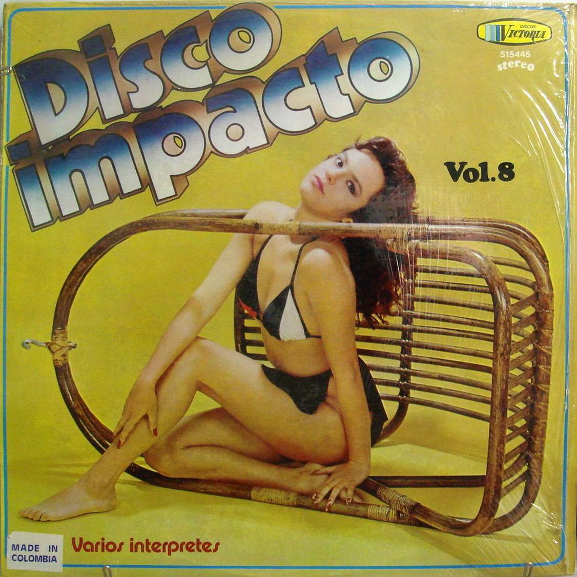
#7 The Unusual and Unconventional Album Cover Designs From the 1960s and 1970s #7 Cover Art
Bold lettering reading “Disco Impacto” leans across a mustard-yellow field, setting a loud, playful tone before your eye even reaches the model posed inside a toppled wicker chair. The composition turns everyday furniture into a graphic frame, with the figure’s relaxed gaze and angular pose doing as much design work as the typography. It’s the…
-

#9 Advertising the Skies: A Look at Imperial Airways Posters Promoting Early Air Travel in the 1920s and 1930s #9
Bold lettering shouts “AFRICA” across the top of this Imperial Airways poster, while a small aircraft skims the sky above a stylized rural scene. In the foreground, silhouetted figures gather around bundles and tools, their clothing rendered in bright blocks of color against warm earth tones and a sweeping hill. The composition balances everyday labor…
-
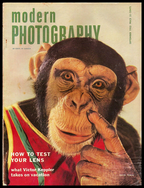
#2 A Look Back at Vintage Modern Photography Magazine Covers from the 1950s and 1960s #2 Cover Art
Bold green lettering spells out *Modern Photography* above an unforgettable close-up: a chimpanzee in a red garment with striped trim, staring straight at the viewer while raising a finger toward its face. The design leans into color, humor, and immediacy—exactly the kind of attention-grabbing cover art that helped photography magazines stand out on mid-century newsstands.…
-
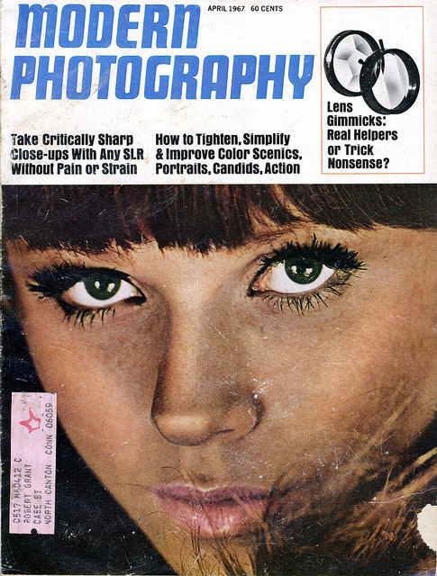
#18 A Look Back at Vintage Modern Photography Magazine Covers from the 1950s and 1960s #18 Cover Art
Bold typography and a tightly cropped portrait announce the era of *Modern Photography* with the immediacy only mid-century magazine design could manage. The April 1967 cover, priced at 60 cents, pairs a wide, blue masthead with a face-filling close-up—heavy lashes, sharp eyeliner, and a direct gaze—turning photographic technique into pop-culture allure. Even the worn edges…
-
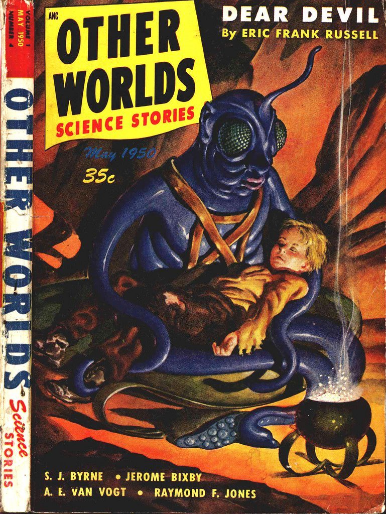
#3 Other Worlds, 1950
Bold pulp colors and urgent typography announce the May 1950 issue of *Other Worlds Science Stories*, a time capsule from the mid-century boom in science-fiction magazines. The cover sells sensation at a glance—blocky lettering, a prominent price mark, and the promise of “Dear Devil” by Eric Frank Russell—while the worn edges and creased spine quietly…