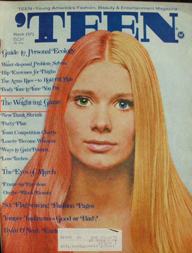
Bold, blocky lettering spells out **TEEN** across the top, framing a striking close-up portrait that does all the talking. The cover’s palette—cool blues in the masthead, warm honey-blonde hair, and a softly lit face—feels like a time capsule of magazine design when airbrushed polish and direct eye contact were the surest way to stop a reader at the newsstand.
Along the left margin, the cover lines read like an instant syllabus on the era’s priorities: fashion and beauty sit shoulder-to-shoulder with “personal ecology,” exercise tips, and plenty of talk about “weight.” One headline, **“The Weight-ing Game,”** stands out, hinting at how teen magazine covers often packaged body and self-image as both entertainment and instruction—an approach that shaped generations of readers and still echoes in today’s social media wellness culture.
For anyone exploring vintage teen magazine covers and cover art, details like the typography hierarchy, tight cropping, and text-heavy layout are the real story behind the story. The page feels designed to promise guidance, confidence, and belonging in a single glance—making it a fascinating artifact for collectors, pop-culture historians, and readers curious about how youth identity was marketed through classic magazine cover design.