Category: Cover Art
Dive into a gallery of vintage cover art from books, magazines, and albums. Discover how graphic design and illustration reflected the moods of their times.
These covers capture the essence of cultural evolution — from bold propaganda to elegant minimalism.
-
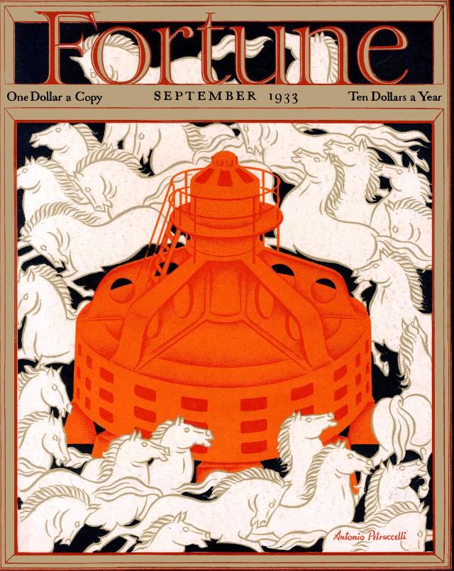
#11 Cover of Fortune magazine, September 1933
Fortune’s September 1933 cover makes an immediate statement with bold Art Deco typography and a clean, poster-like layout that feels both modern and monumental. The masthead sits above pricing details—“One Dollar a Copy” and “Ten Dollars a Year”—framing the issue as a premium product in an era when money and confidence were anything but taken…
-
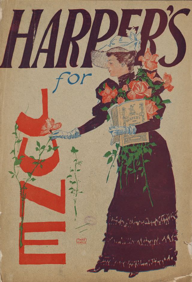
#5 A woman stands holding a magazine and flowers while she picks another flower, Harper’s for June, 1893
Harper’s for June, 1893, greets the viewer with bold typography and a poised figure caught mid-gesture, reaching toward a delicate bloom. The woman’s dark, floor-length dress and pale gloves create a dramatic silhouette against the light background, while the magazine tucked in her arm anchors the scene as unmistakable cover art. Splashes of rose-pink and…
-
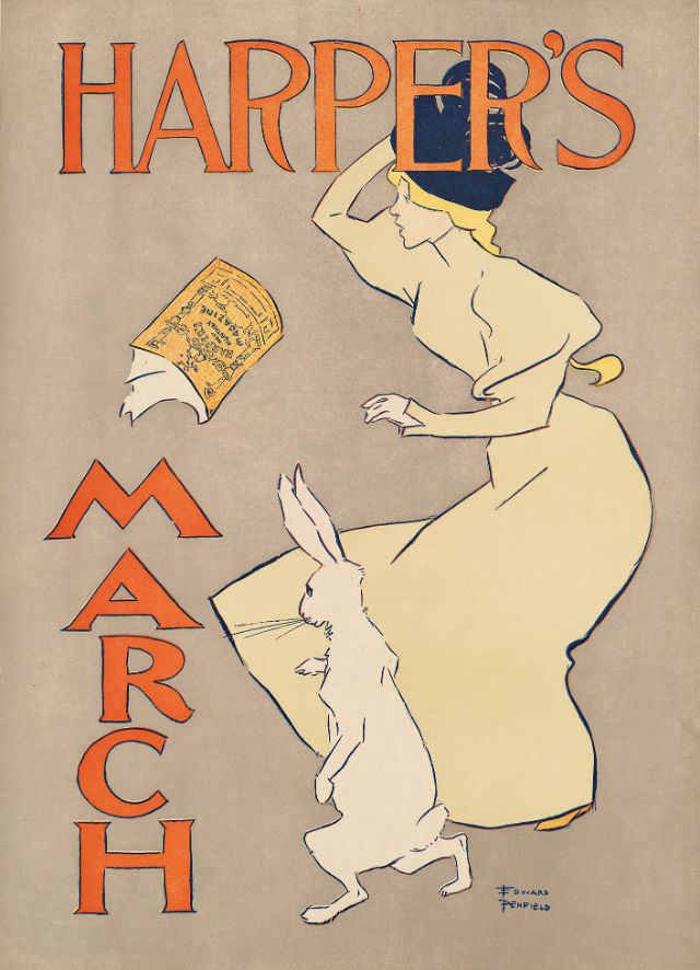
#21 A woman stands next to a rabbit, both looking at a floating magazine, Harper’s March, 1895
Harper’s March 1895 cover art leans into whimsy: a fashionably dressed woman turns in profile, one hand raised as if shielding her eyes while she studies a magazine that seems to drift in midair. Beside her, a rabbit rises up on its hind legs, ears alert, mirroring her curiosity and adding a playful, storybook note…
-
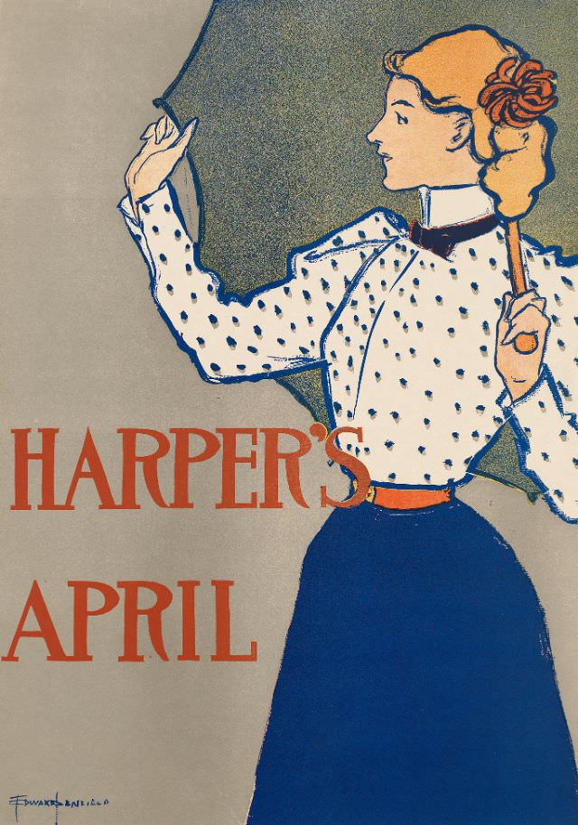
#37 A woman stands holding an umbrella open above her, Harper’s April, 1897
Bold lettering announces “HARPER’S” and “APRIL” across a spare field of color, while a stylish woman turns in profile beneath an open umbrella. Her high-collared blouse is patterned with small dots, cinched neatly at the waist with a bright belt, and set against a long, dark skirt that gives the composition its calm, vertical weight.…
-
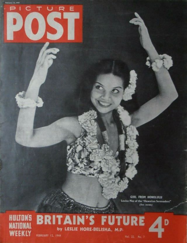
#8 Girl From Honolulu, Picture Post, February 12th, 1944
Bold red mastheads frame a smiling dancer in mid-gesture on the cover of *Picture Post*, dated February 12th, 1944. Advertised as the “Girl From Honolulu,” she’s styled for impact: floral lei and matching wrist garlands, a patterned top, and hands lifted in a poised, graceful curve that hints at hula-inspired stage movement. Her direct, joyful…
-
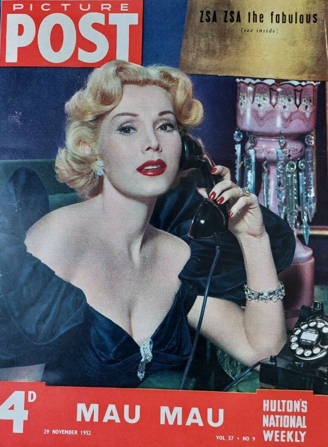
#24 Zsa Zsa Gabor, Picture Post, November 29th, 1952
Glamour takes center stage on the cover of Picture Post dated November 29th, 1952, with Zsa Zsa Gabor posed in a richly lit, studio-style setting. Her coiffed blonde waves, jeweled earrings, and off-the-shoulder dark gown lean into the era’s polished Hollywood look, while vivid lipstick and manicured nails sharpen the sense of carefully composed allure.…
-
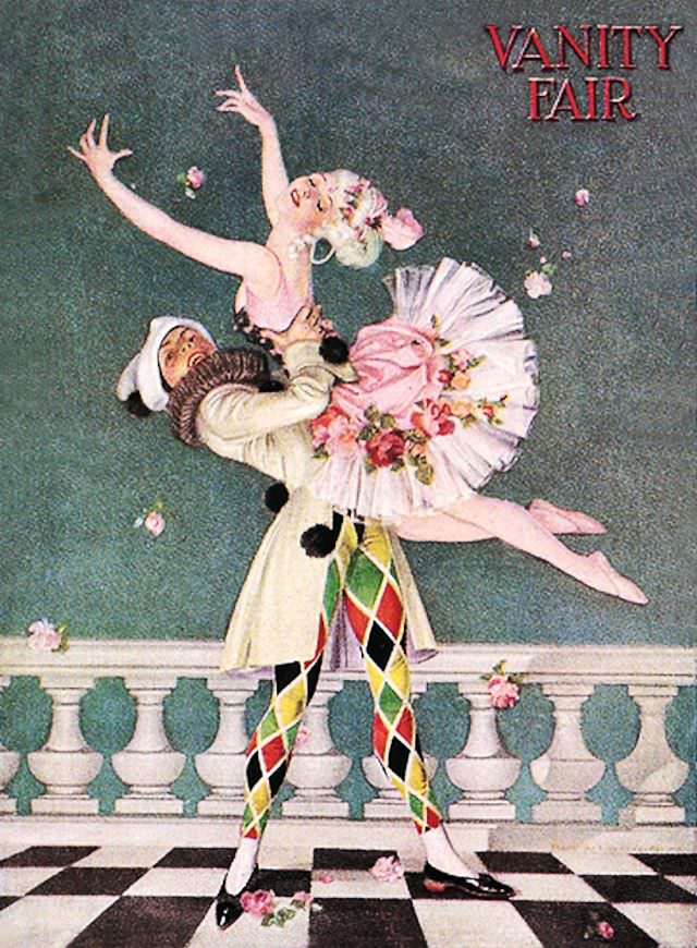
#5 Vanity Fair cover, January 1917
Bold lettering announces “Vanity Fair” above a stage-like tableau where a ballerina in a pink, flower-trimmed tutu is swept upward in midair. Her arms reach skyward as rose petals drift around her, turning the cover into a frozen moment of performance and applause. Against a muted green backdrop, the pale costume, soft blush tones, and…
-
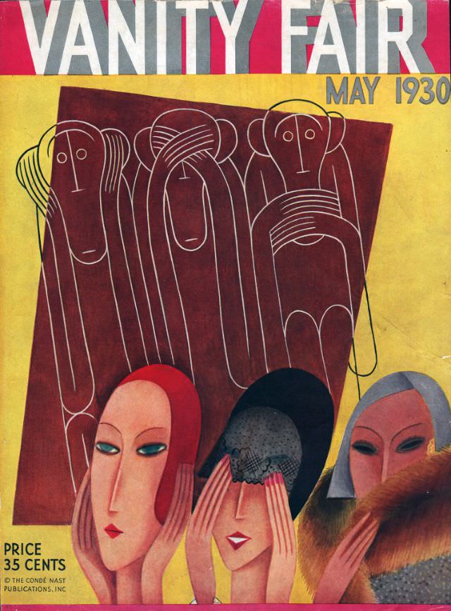
#21 Vanity Fair cover, May 1930
Bold blocks of red, ochre, and chocolate-brown set the stage for the Vanity Fair cover dated May 1930, a striking example of early 20th-century magazine design. Across the top, the towering masthead competes for attention with the clean “MAY 1930” lettering, while a small note at the lower left—“PRICE 35 CENTS” and the Condé Nast…
-

#37 Vanity Fair cover, August 1935
Across a bold orange field, the August 1935 Vanity Fair cover stages a darkly comic allegory of power: a menacing, green-faced figure leans over a globe as though the world were a plaything. The oversized typography of “VANITY FAIR” crowns the scene, while the stylized illustration—sharp angles, dramatic shadows, and theatrical color—signals the magazine’s taste…
-
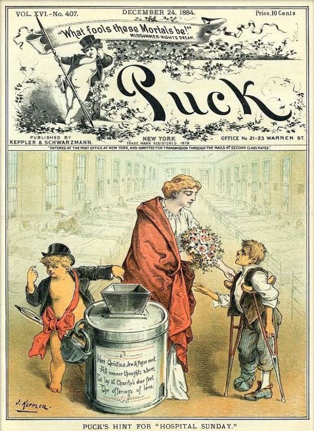
#13 Puck magazine cover, December 24, 1884
Dated December 24, 1884, this Puck magazine cover pairs holiday-season timing with a pointed social message. The ornate masthead and theatrical banner (“What fools these mortals be!”) frame the magazine’s bold typography, while the detailed illustration below pulls the viewer into a city street scene that feels both festive and uneasy.