Category: Cover Art
Dive into a gallery of vintage cover art from books, magazines, and albums. Discover how graphic design and illustration reflected the moods of their times.
These covers capture the essence of cultural evolution — from bold propaganda to elegant minimalism.
-
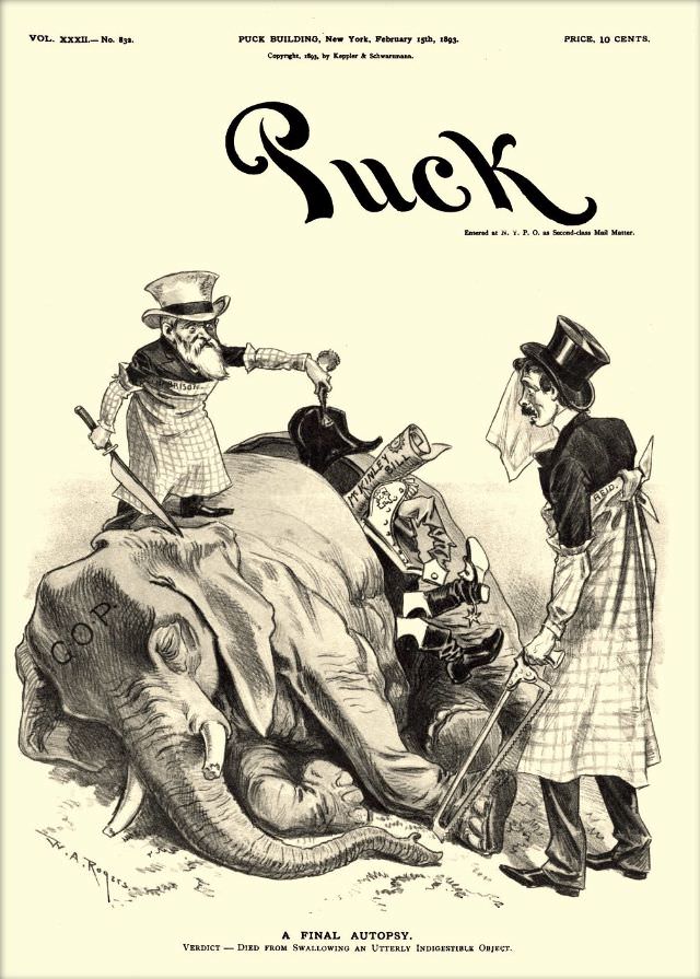
#29 Puck magazine cover, February 15, 1893
Bold lettering across the top announces Puck, and beneath it a pointed cartoon turns the cover into a miniature stage for Gilded Age satire. The scene centers on a collapsed elephant marked “G.O.P.” while two apron-clad figures in tall hats hover over the body, one holding a knife and the other prepared with a saw.…
-

#1 Judge magazine, January 20, 1912
Bold red letters spell out JUDGE across the top of this January 20, 1912 cover, priced at 10 cents, set against a clean white field that makes the artwork feel airy and intimate. At center, a fashionable young woman in a softly draped dress cradles a small child, their faces turned toward each other in…
-
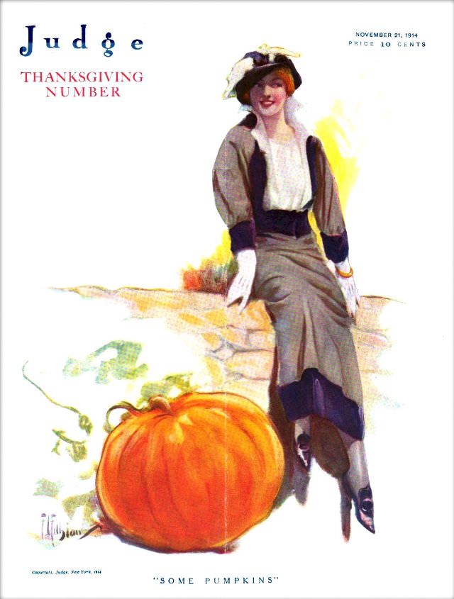
#17 Judge magazine, November, 21, 1914
Bold lettering spells out *Judge* alongside the words “Thanksgiving Number,” setting an unmistakably seasonal tone for the magazine cover dated November 21, 1914. The composition is airy and elegant, with generous white space that draws the eye to a stylish figure posed at ease, as if pausing during an autumn outing. A price of 10…
-
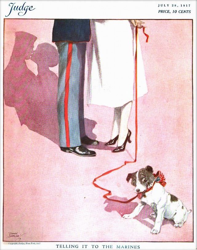
#33 Judge magazine, July 28, 1917
Judge magazine’s July 28, 1917 cover distills a whole mood into a few deft lines and a wash of rosy color. At the top, the familiar masthead and the small-print “Price, 10 cents” frame an illustration that keeps faces out of view, letting posture and costume do the talking. The scene is set low to…
-
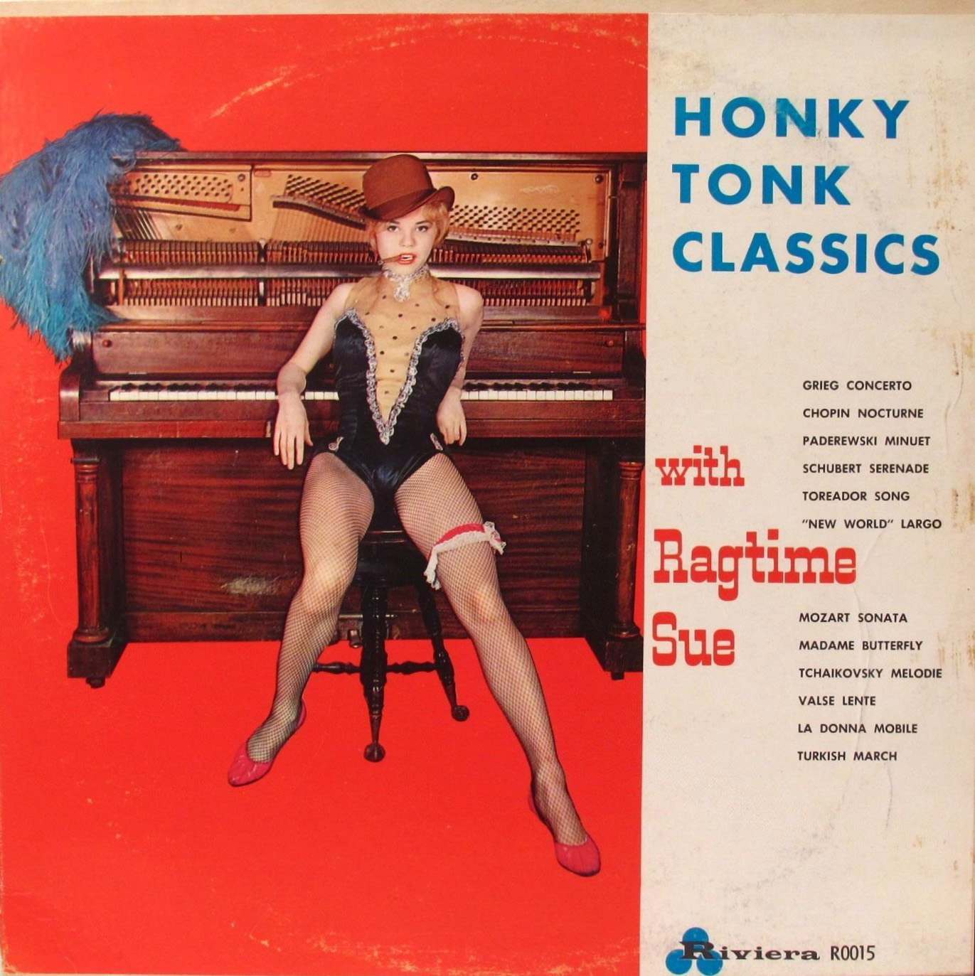
#9 Pianos, Pin-Ups, and Party Tunes: Exploring the Wild World of Honky-Tonk Records #9 Cover Art
Bright red floods the sleeve, turning an upright piano into a stage and a statement. A showgirl in a tiny top hat and fishnets lounges on the bench with a cool, confrontational stare, while a fluffy blue feather boa drapes over the instrument like leftover confetti from the last number. The whole composition sells “honky-tonk”…
-
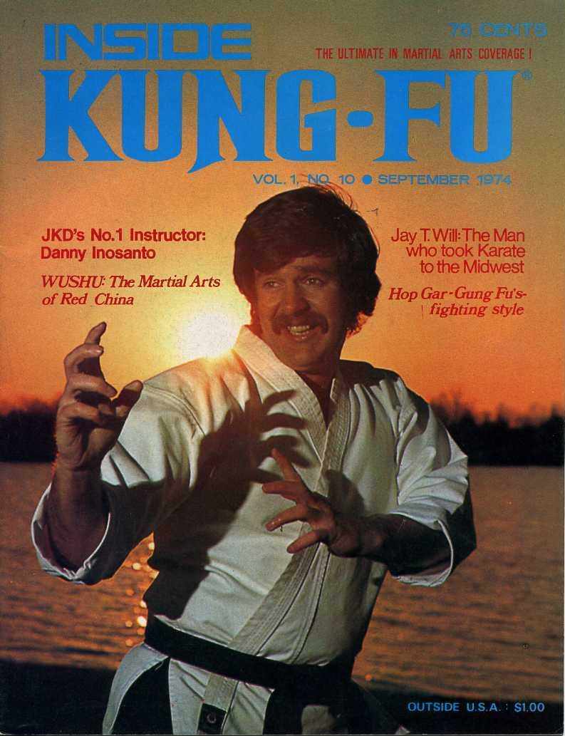
#5 Everybody Was Kung Fu Fighting: Exploring the Heyday of Martial Arts Mags in the 1970s and 1980s #5 Cov
Bold block lettering shouts “INSIDE KUNG-FU” across a warm, sunset-toned cover, priced at 79 cents and tagged as “The ultimate in martial arts coverage!” A moustached martial artist in a white gi and dark belt holds a poised fighting stance, hands raised and fingers set as if mid-demonstration, his figure silhouetted against shimmering water. The…
-
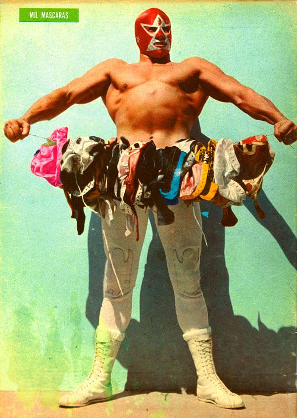
#9 Blood, Masks, and Glory: A Visual Tour Through Lucha Libre Magazine Covers of the 1970s #9 Cover Art
A masked titan stands against a sun-faded turquoise wall, arms stretched wide in a pose that feels equal parts challenge and celebration. The cover text identifies him as “Mil Mascaras,” and the composition leans into his larger-than-life reputation: bare-chested, laced boots planted, red mask gleaming like a badge. It’s the kind of bold, immediate visual…
-
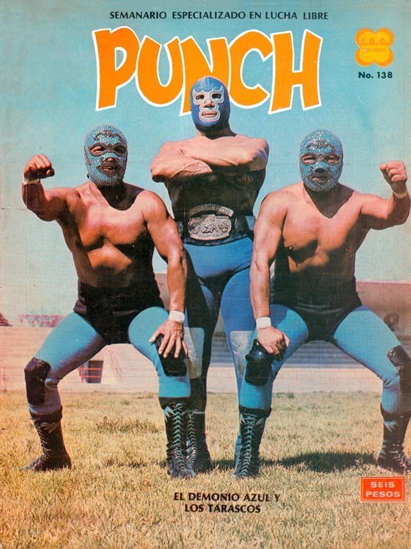
#25 Blood, Masks, and Glory: A Visual Tour Through Lucha Libre Magazine Covers of the 1970s #25 Cover Art
Bold color and bigger-than-life posing announce the pulp energy of 1970s lucha libre cover art, where spectacle mattered as much as sport. The magazine masthead “PUNCH” dominates the sky-blue background, framing three masked wrestlers in matching blue-and-black gear as if they’re stepping out of the ring and into pop culture. Even without motion, the composition…
-
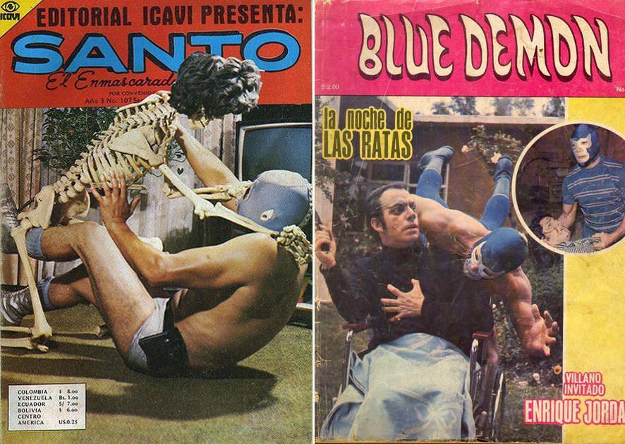
#3 The World of Spanish and Italian Crime Comics (Fotonovelas) from the 1960s-70s: Stories Told with Sensational Photogr
Lurid color, outsized typography, and masked heroes in mid-brawl—these covers drop you straight into the high-drama universe of Spanish and Italian crime comics and fotonovelas from the 1960s–70s. On one side, “SANTO” dominates the masthead above a staged wrestling struggle that leans into shock value and pulp spectacle; on the other, “BLUE DEMON” frames a…
-
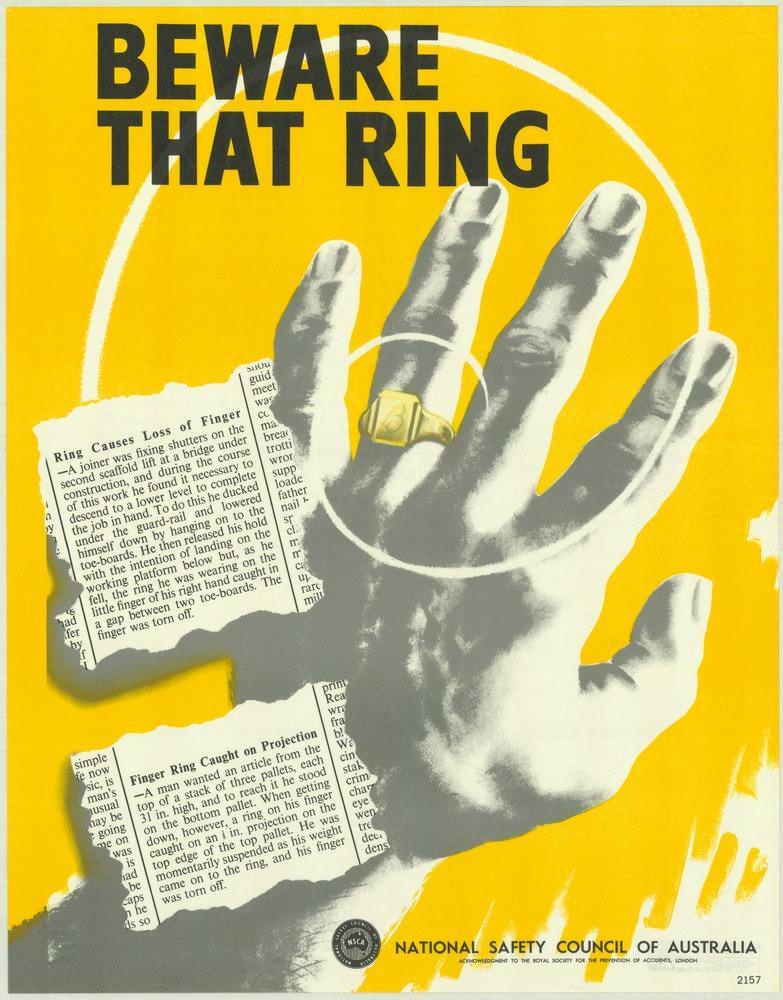
#7 National Safety Council of Australia Posters from the 1970s: Visual Messages for Keeping People Safe and Well
Bold, urgent lettering—“BEWARE THAT RING”—dominates the cover art, set against a bright yellow field designed to stop a passer-by in their tracks. A stark, high-contrast hand reaches across the page, a gold ring catching the eye as white concentric circles draw attention to the finger like a warning beacon. Alongside it, torn newspaper-style clippings hint…