Category: Cover Art
Dive into a gallery of vintage cover art from books, magazines, and albums. Discover how graphic design and illustration reflected the moods of their times.
These covers capture the essence of cultural evolution — from bold propaganda to elegant minimalism.
-

#8 Judge magazine, January 11, 1913
January 11, 1913 sits neatly atop this Judge magazine cover, where a poised young woman occupies a dressing-table chair in a softly stylized interior. The palette leans into warm pinks and creams, punctuated by bold navy striping on her fashionable dress, while bright red heels add a confident finishing note. Above the scene, the crisp…
-
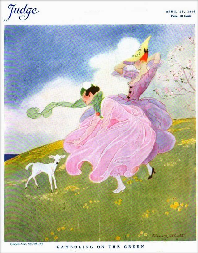
#24 Judge magazine, April 29, 1916
April 29, 1916 appears in the corner of this Judge magazine cover, a bright, airy illustration that leans into movement and mood rather than hard detail. A stylish figure sweeps across a grassy hill in a billowing lavender dress, green scarf trailing behind like a ribbon caught by the wind. Nearby, a small white dog…
-
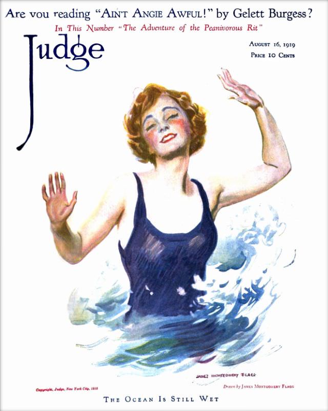
#40 Judge magazine, August 16, 1919
A splash of color and a wink of humor define the cover of *Judge* magazine dated August 16, 1919. The masthead looms in bold lettering above a lively illustration of a woman waist-deep in churning blue water, her arms lifted as if balancing against the surf or greeting the viewer. With rosy cheeks, short waved…
-

#16 Pianos, Pin-Ups, and Party Tunes: Exploring the Wild World of Honky-Tonk Records #16 Cover Art
Bright as a neon sign and twice as loud, this cover for Joe “Fingers” Carr’s “Rough-House Piano” turns honky-tonk music into a full-blown scene: a grinning pianist at an upright, hands flying over the keys while the room tilts toward mischief. The bold banner lettering and the Capitol Records logo frame the promise right on…
-

#12 Everybody Was Kung Fu Fighting: Exploring the Heyday of Martial Arts Mags in the 1970s and 1980s #12 Co
Bold, oversized lettering announces BLACK BELT across a dramatic illustrated cover, the kind of newsstand beacon that helped fuel martial arts mania in the 1970s and 1980s. The artwork stages two gi-clad fighters in mid-technique, their white uniforms slicing through a warm, cinematic palette while a larger, watchful face looms behind like a poster for…
-

#16 Blood, Masks, and Glory: A Visual Tour Through Lucha Libre Magazine Covers of the 1970s #16 Cover Art
Chrome-bright costumes and hard-edged masks announce the world of 1970s lucha libre magazine cover art, where wrestlers were staged like comic-book heroes. The bold “LUCHA LIBRE” masthead slants across the corner, while three figures pose in a theatrical tableau: one raised high in a triumphant, almost statue-like stance, flanked by two partners crouched and ready.…
-

#32 Blood, Masks, and Glory: A Visual Tour Through Lucha Libre Magazine Covers of the 1970s #32 Cover Art
Bright cyan floods the cover, turning masked wrestling into pop-art spectacle while keeping the stakes unmistakably serious. Two luchadores pose in crisp white masks and gear: one seated with a cape draped over his shoulders, the other standing behind in a short-sleeved shirt, hands set with confident ease. Bold, diagonal “LUCHA LIBRE” lettering and punchy…
-
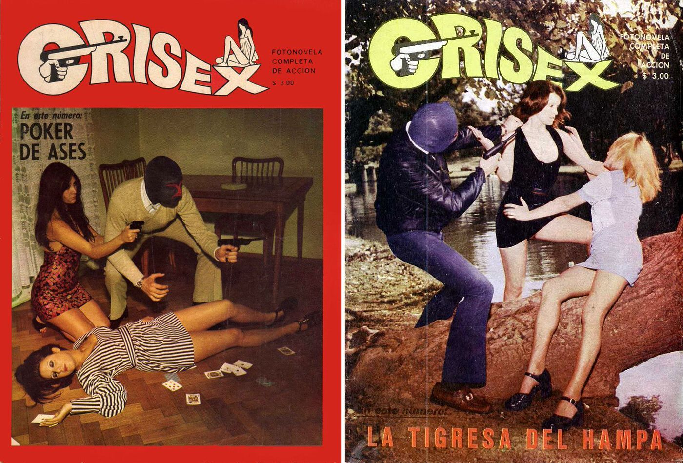
#10 The World of Spanish and Italian Crime Comics (Fotonovelas) from the 1960s-70s: Stories Told with Sensational Photogr
Lurid typography, pistol silhouettes, and staged peril leap off these “CRISEX” covers, a perfect entry point into the Spanish and Italian crime fotonovela boom of the 1960s–70s. Marketed as “fotonovela completa de acción,” the format sold suspense in a tabloid register—bold mastheads, bright blocks of color, and sensational taglines designed to grab a kiosk browser…
-
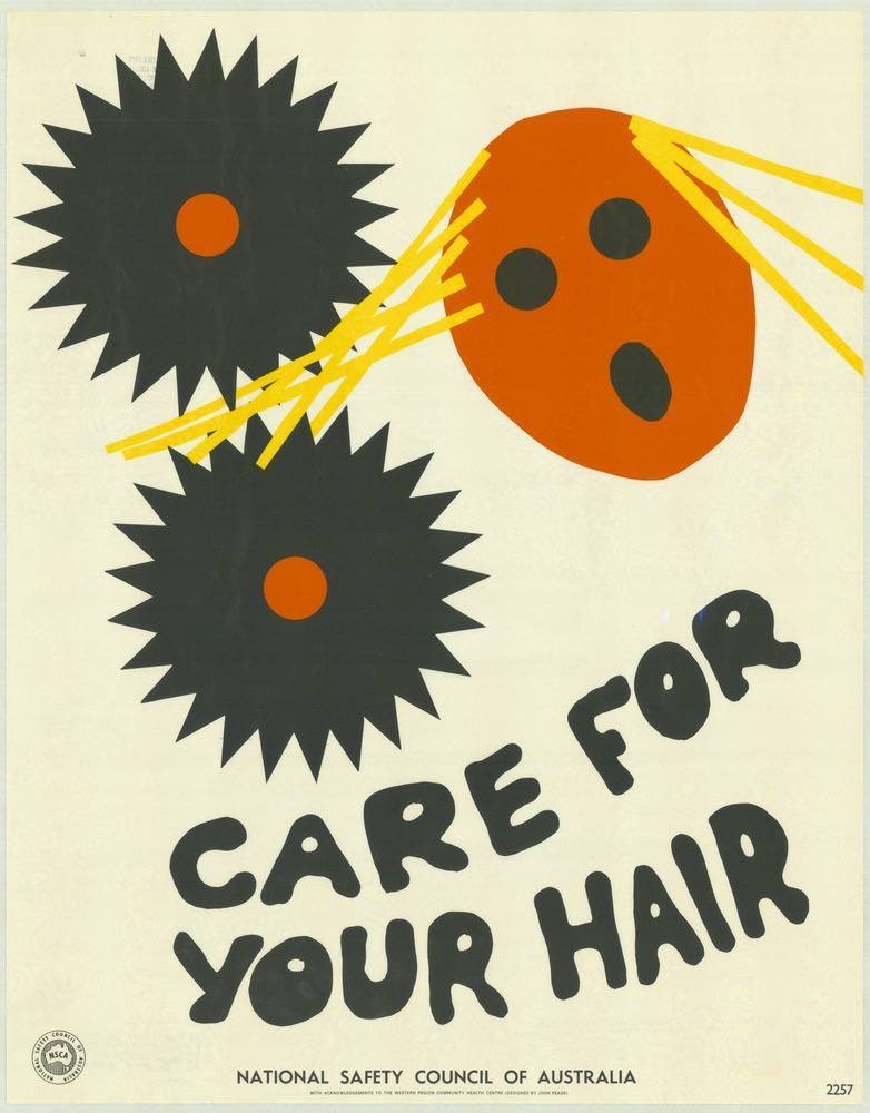
#14 National Safety Council of Australia Posters from the 1970s: Visual Messages for Keeping People Safe and Well
Bold, cut-paper shapes and high-contrast colour announce a no-nonsense safety message, pairing two jagged black “gears” with a bright orange head and strips of yellow hair caught in the danger zone. The hand-drawn lettering—“CARE FOR YOUR HAIR”—leans playfully across the lower half, yet the visual warning is immediate: long hair and moving machinery don’t mix.
-
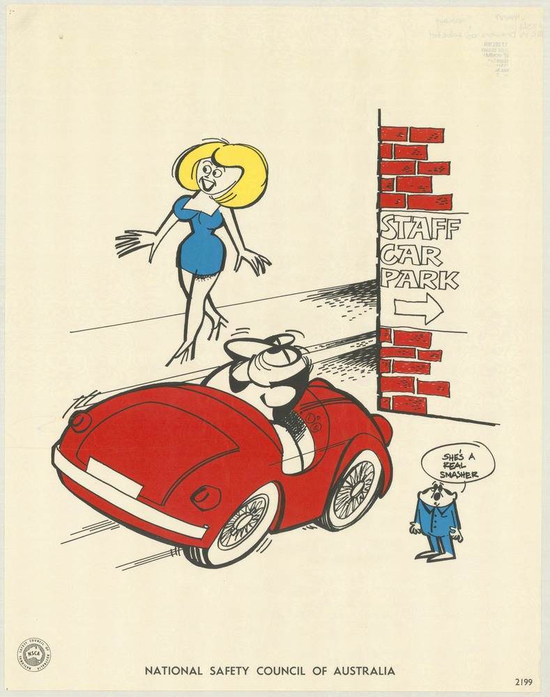
#30 National Safety Council of Australia Posters from the 1970s: Visual Messages for Keeping People Safe and Well
Bright, cheeky illustration rather than stern warning sets the tone for this National Safety Council of Australia poster from the 1970s, where a red sports car pulls into view beside a brick wall marked “STAFF CAR PARK.” A stylised blonde figure in a blue dress strides across the open space, while a small onlooker offers…