Category: Cover Art
Dive into a gallery of vintage cover art from books, magazines, and albums. Discover how graphic design and illustration reflected the moods of their times.
These covers capture the essence of cultural evolution — from bold propaganda to elegant minimalism.
-
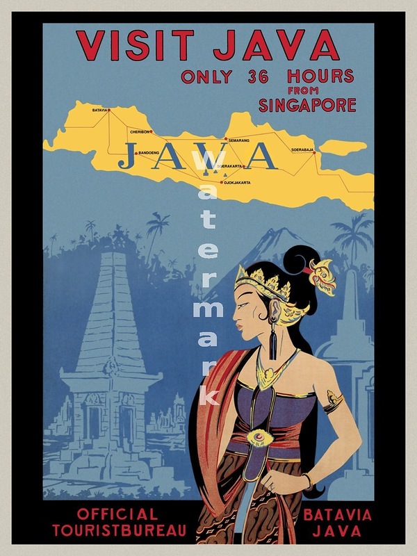
#18 Around the World in Posters: A Look at Vintage Travel Advertising #18 Cover Art
Bold lettering urges travelers to “Visit Java,” promising the island is “only 36 hours from Singapore,” and the design wastes no time setting a mood. A simplified map stretches across the top with place names marked along rail-like lines, turning geography into an itinerary and suggesting that modern transport could make distant destinations feel reassuringly…
-
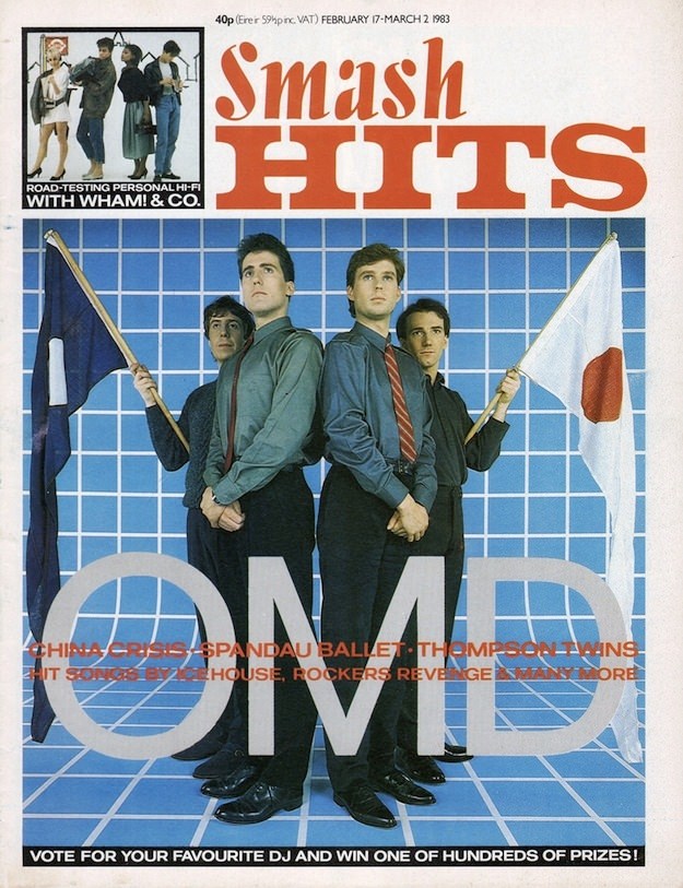
#7 Inside Smash Hits: The Iconic Magazine Covers of the 1980s #7 Cover Art
Bold typography and pop-colour confidence make this Smash Hits cover an instant time capsule of 1980s music magazine culture. The masthead dominates the page in classic tabloid style, while the price (40p) and the issue window—February (17–March 2) 1983—anchor it firmly in its moment. Even before you read a single line, the design signals what…
-

#23 Inside Smash Hits: The Iconic Magazine Covers of the 1980s #23 Cover Art
Bold typography and bigger-than-life styling leap off this Smash Hits cover, with the familiar sky-blue masthead dominating the top and a sharply framed studio portrait anchoring the page. Two pop stars pose shoulder-to-shoulder in full 1980s flair—teased hair, dramatic eyeliner, glossy lipstick, and statement jewelry—while ribbons and polka-dot fabrics add that playful, mischievous edge the…
-
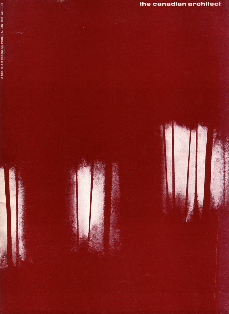
#5 The Canadian architect – August 1964
A field of deep red dominates the cover, interrupted by pale, vertical windows that feel half-revealed—like light breaking through a wall before the plaster is finished. Thin, ink-like drips run downward across the composition, lending the surface a sense of gravity and motion. In the corner, the simple masthead “the canadian architect” anchors the abstraction,…
-
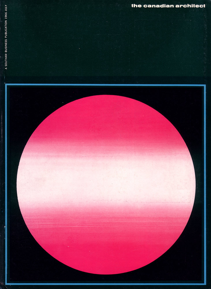
#21 The Canadian architect – July 1966
Bold modernism radiates from the July 1966 cover of *The Canadian Architect*, where a luminous pink-red circle floats against a deep, inky field. Subtle horizontal banding softens the geometric form, creating a sense of atmosphere—part sunrise, part lens flare, part carefully calibrated gradient. A thin blue border frames the composition with crisp precision, reinforcing the…
-
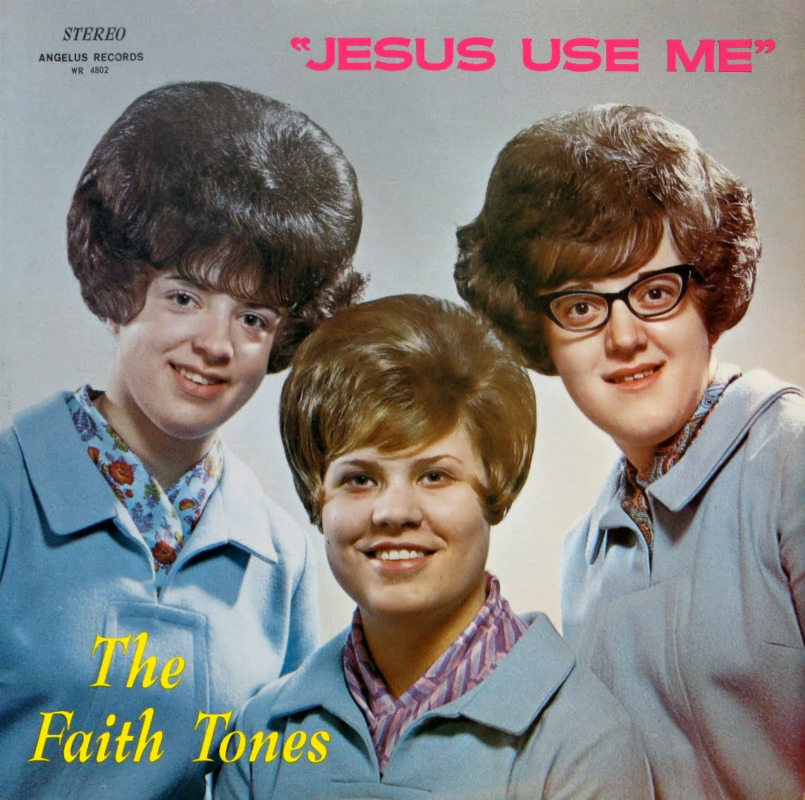
#10 So Bad, They’re Good: Vintage Album Covers That Will Make You Laugh #10 Cover Art
Bold pink lettering declares “JESUS USE ME” across the top, while three smiling women pose beneath it in matching light-blue outerwear and neatly styled bouffant hair. The label text at the corner reads “STEREO” and “ANGELUS RECORDS,” giving the cover that instantly time-capsuled feel of mid-century print design. Their friendly expressions and coordinated wardrobe sell…
-
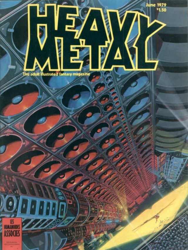
#1 Heavy Metal Magazine Covers: A 1970s Blast of Sci-Fi and Fantasy #1 Cover Art
Bold, jagged lettering shouts “HEAVY METAL” across a swirling sci‑fi vista, the kind of cover that could stop a reader mid‑aisle. Below the masthead, an immense, mechanical structure stretches into depth like a tunnel of repeating pods and glowing red apertures, pulling the eye forward with dizzying perspective. The palette—steely blues, smoky grays, and hot…
-
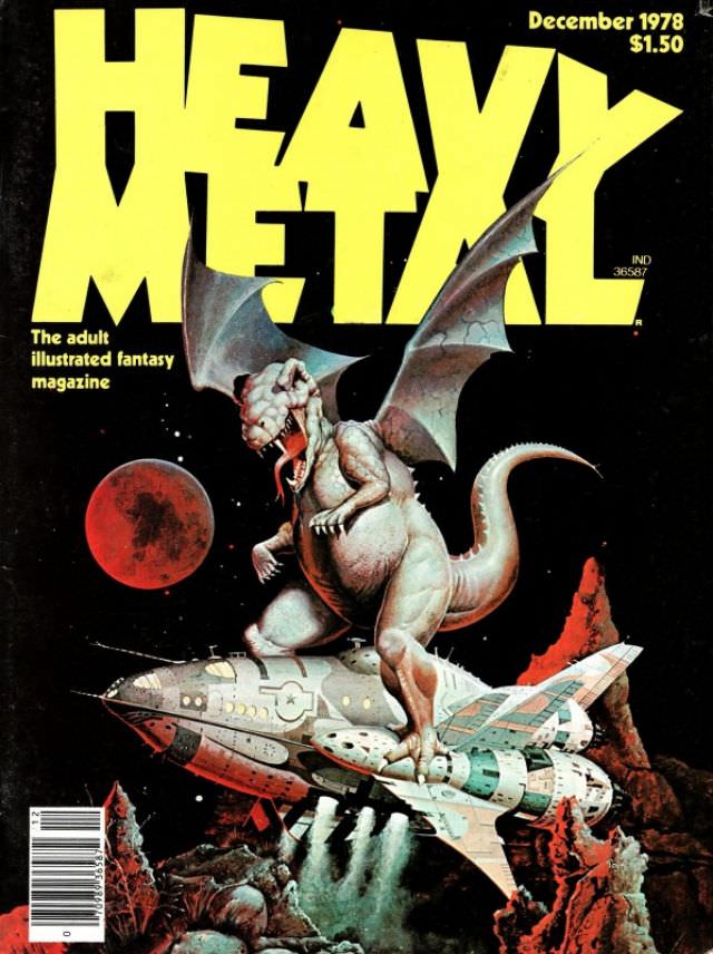
#17 Heavy Metal Magazine Covers: A 1970s Blast of Sci-Fi and Fantasy #17 Cover Art
Bold, blocky “HEAVY METAL” lettering dominates the top of this cover, immediately setting the loud, rebellious tone that made the magazine a beacon for adult illustrated fantasy. The issue is clearly marked December 1978 with a $1.50 cover price, small details that anchor the artwork in its era while letting the imagination run wild. Even…
-

#8 The A-Frame’s Influence: How This Iconic Pose Continues to Shape Modern Fashion, Art, and Movie Posters #8
A bold, wide-legged stance dominates the composition, turning a simple posture into a piece of visual shorthand for danger, confidence, and control. Framed from the waist down in glossy, high-contrast color, the figure’s “A-frame” silhouette pulls the eye straight to the center of the poster, where urban night lights and looming shapes heighten the sense…
-
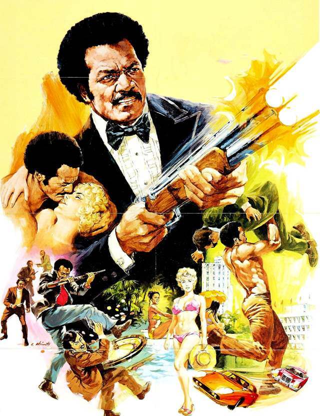
#1 Slaughter (1972) Movie Poster
Bold brushstrokes and sun-hot yellows set the tone for the Slaughter (1972) movie poster, a piece of cover art that leans hard into high-stakes action. At the center, a tuxedoed figure grips a long gun as the composition erupts around him, giving the artwork a sense of forward momentum and imminent danger. The painterly style,…