Category: Cover Art
Dive into a gallery of vintage cover art from books, magazines, and albums. Discover how graphic design and illustration reflected the moods of their times.
These covers capture the essence of cultural evolution — from bold propaganda to elegant minimalism.
-
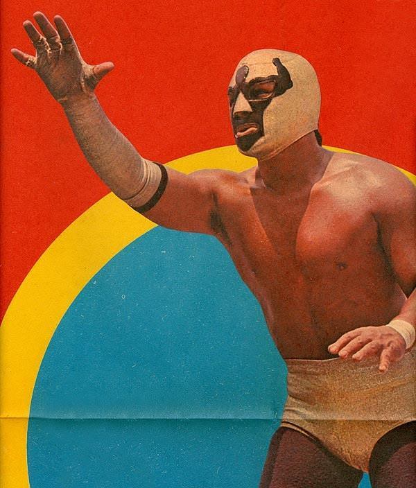
#10 Blood, Masks, and Glory: A Visual Tour Through Lucha Libre Magazine Covers of the 1970s #10 Cover Art
Red and teal collide behind a masked luchador who reaches outward as if summoning the crowd, his open hand frozen mid-gesture. The design reads like classic 1970s lucha libre magazine cover art: bold color fields, dramatic contrast, and a central figure posed as both athlete and icon. Even without a visible arena, the cropped composition…
-
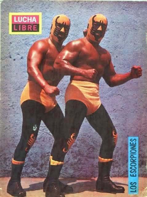
#26 Blood, Masks, and Glory: A Visual Tour Through Lucha Libre Magazine Covers of the 1970s #26 Cover Art
Neon color and theatrical menace collide on this 1970s-style Lucha Libre magazine cover, where two masked wrestlers pose in matching gear against a stark studio backdrop. The bold “LUCHA LIBRE” masthead anchors the composition, while the duo’s squared shoulders and raised fists sell the promise of combat before a single hold is thrown. It’s cover…
-
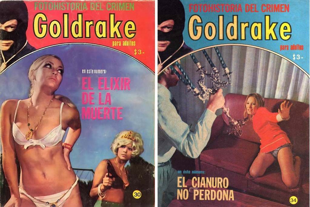
#4 The World of Spanish and Italian Crime Comics (Fotonovelas) from the 1960s-70s: Stories Told with Sensational Photogr
Bright pulp color and bold lettering pull you straight into the lurid world of *Fotohistoria del Crimen* and its recurring banner title, “Goldrake,” a crime fotonovela “para adultos.” These cover designs lean on the era’s magazine-stand theater—large, sensational type, dramatic posing, and a promise of danger—making them perfect examples of Spanish-language crime comics that told…
-
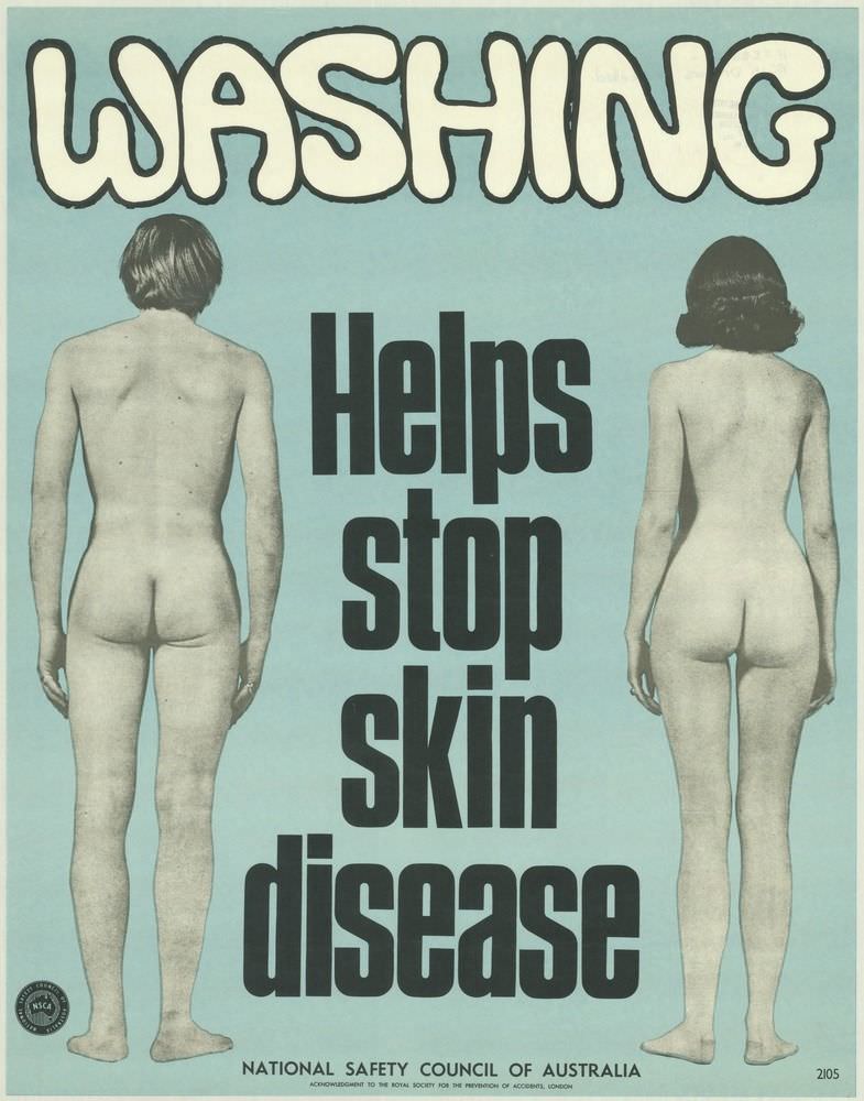
#8 National Safety Council of Australia Posters from the 1970s: Visual Messages for Keeping People Safe and Well
Bold, bubble-like lettering spelling “WASHING” crowns a stark public health message: “Helps stop skin disease.” Set against a flat, pale blue field, two unclothed figures are shown from behind at either side, turning the human body into a straightforward reminder of hygiene and prevention rather than a scene with narrative distraction.
-
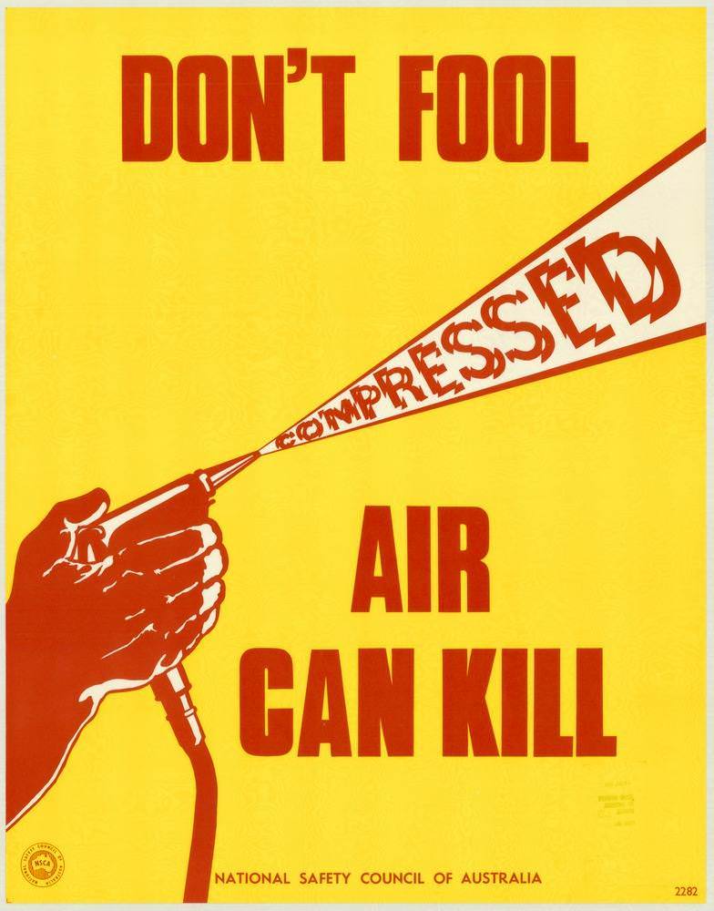
#24 National Safety Council of Australia Posters from the 1970s: Visual Messages for Keeping People Safe and Well
Bold yellow and red graphics deliver a blunt warning: “DON’T FOOL … AIR CAN KILL.” A clenched hand grips an air hose, and the word “COMPRESSED” is blasted forward like a dangerous jet, turning typography into a visual metaphor for force. Along the bottom edge, the credit line for the National Safety Council of Australia…
-
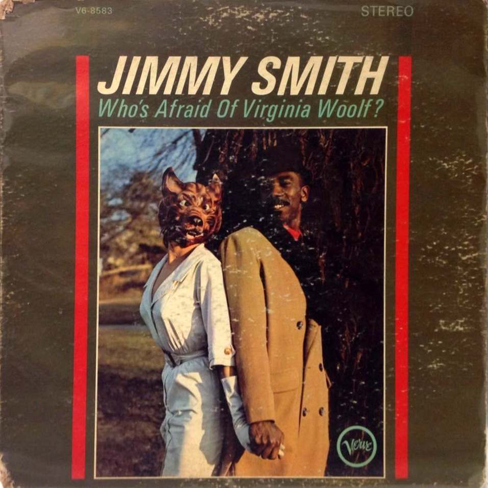
#9 The Unusual and Unconventional Album Cover Designs From the 1960s and 1970s #9 Cover Art
Bold typography and a cheeky question—“Who’s Afraid of Virginia Woolf?”—set the tone before your eyes even reach the scene below. The sleeve, credited to Jimmy Smith, wears its age in scuffs and faded color, yet that lived-in patina only amplifies the era’s tactile charm: thick lettering, hard borders, and the confident promise of “STEREO” at…
-

#11 Advertising the Skies: A Look at Imperial Airways Posters Promoting Early Air Travel in the 1920s and 1930s #1
Bold blocks of color and clean, modern lettering announce “Imperial Airways Trans-African Services,” turning early aviation into a promise of speed, reach, and prestige. A large four‑engine airliner dominates the composition, rendered in cool whites and blues against a warm ochre background, while tiny figures clustered near the fuselage give a sense of scale and…
-
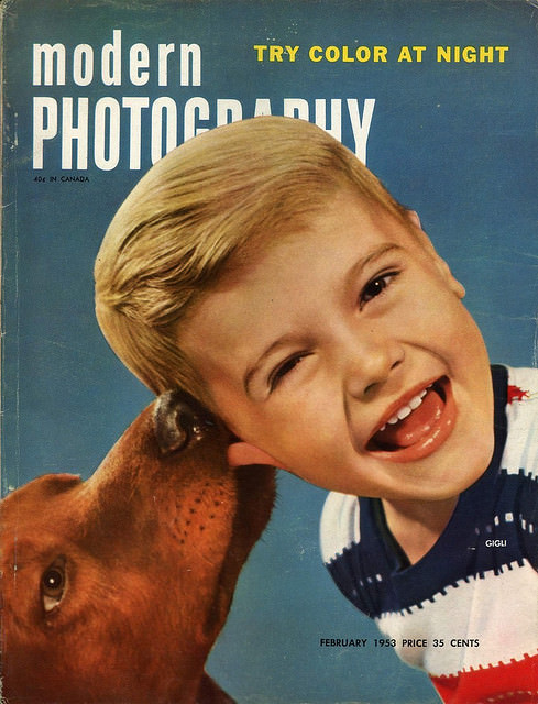
#4 A Look Back at Vintage Modern Photography Magazine Covers from the 1950s and 1960s #4 Cover Art
Bold typography and a bright teal backdrop announce “modern PHOTOGRAPHY,” while the playful cover line “TRY COLOR AT NIGHT” hints at the era’s excitement about new techniques and consumer-friendly color film. A laughing child leans into the frame as a dog nuzzles close, creating an intimate, mid-century moment that feels both staged and wonderfully spontaneous.…
-
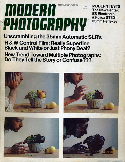
#20 A Look Back at Vintage Modern Photography Magazine Covers from the 1950s and 1960s #20 Cover Art
Bold, blocky typography shouting “Modern Photography” crowns this magazine cover, with a busy scatter of teaser lines that instantly evokes the mid-century newsstand. The issue promises practical know-how—35mm automatic SLRs, black-and-white control film, and debates over “multiple photographs”—making the cover as much a snapshot of consumer camera culture as it is graphic design. Even the…
-
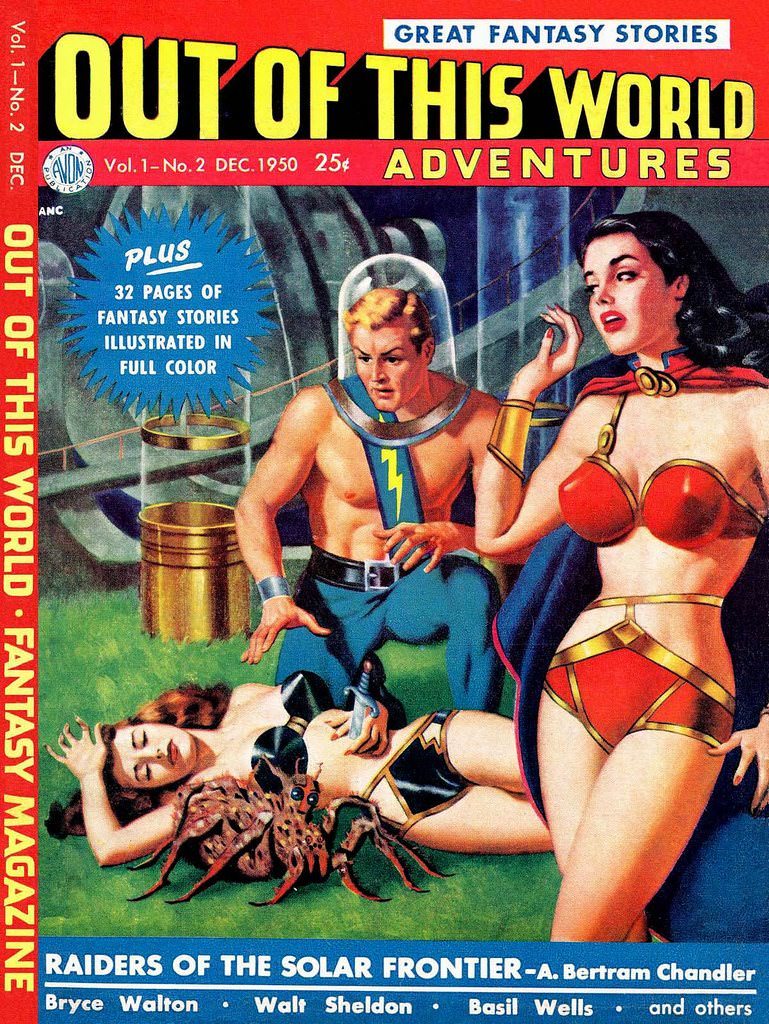
#5 Out of this World Adventures, 1950
Bold lettering shouts “Out of This World Adventures” across a fiery red masthead, framing a slice of mid-century science-fiction spectacle. The cover—tagged “Great Fantasy Stories” and marked Vol. 1, No. 2, Dec. 1950—leans into the era’s love of pulp thrills, promising “32 pages of fantasy stories illustrated in full color” for 25 cents. Even before…