Category: Cover Art
Dive into a gallery of vintage cover art from books, magazines, and albums. Discover how graphic design and illustration reflected the moods of their times.
These covers capture the essence of cultural evolution — from bold propaganda to elegant minimalism.
-

#4 So Bad, They’re Good: Vintage Album Covers That Will Make You Laugh #4 Cover Art
Bold yellow lettering declares “Little David WILKINS” with the boastful subtitle “King Of All The Taverns,” while a small blue price sticker sits in the corner like an accidental badge of thrift-store glory. The cover leans hard into personality: a man caught mid-laugh, head tipped back, framed by soft greenery and a brick wall that…
-
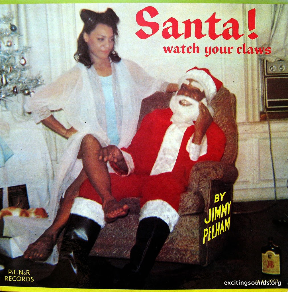
#20 So Bad, They’re Good: Vintage Album Covers That Will Make You Laugh #20 Cover Art
Bold red lettering shouts “Santa! watch your claws” over a living-room scene that’s equal parts holiday cheer and awkward comedy. A woman poses with one hand on her hip while a weary-looking Santa slumps in an armchair, beard askew and expression resigned. The mismatched energy—glamour meets exhaustion—turns what should be seasonal sweetness into the kind…
-
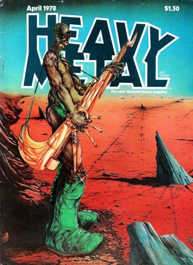
#11 Heavy Metal Magazine Covers: A 1970s Blast of Sci-Fi and Fantasy #11 Cover Art
April 1978 sits boldly at the top of this Heavy Metal magazine cover, priced at $1.50, with the title’s block letters towering over an alien-red landscape. A lone, sinewy figure dominates the foreground, rendered with biomechanical details that blur the line between flesh, armor, and something grown rather than built. Slung across the body is…
-
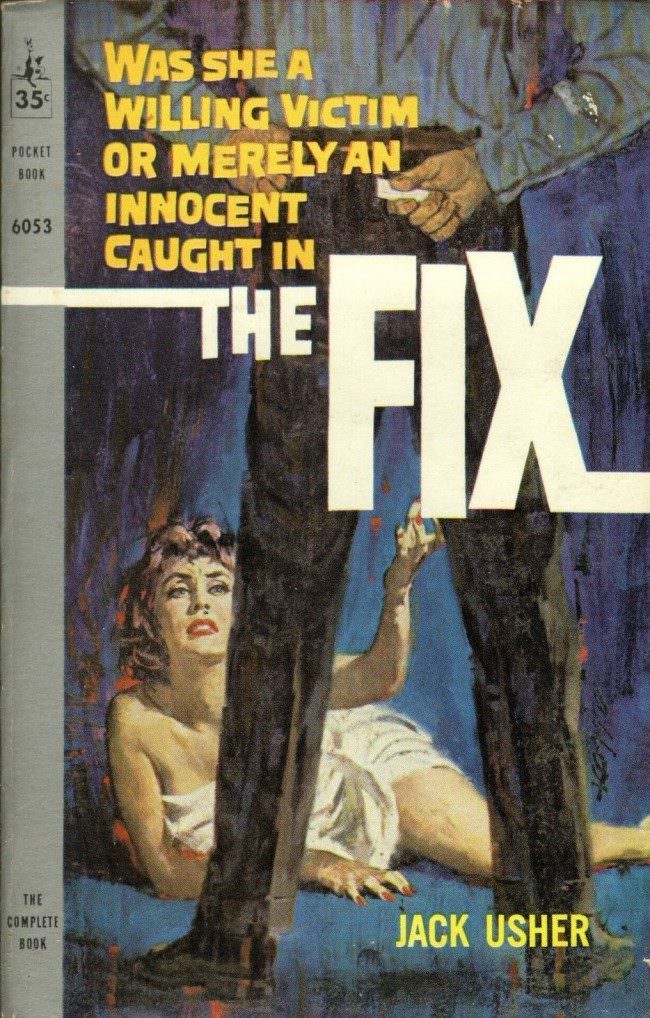
#2 The A-Frame’s Influence: How This Iconic Pose Continues to Shape Modern Fashion, Art, and Movie Posters #2
Bold pulp typography and a tightly staged silhouette do most of the storytelling here: a towering figure in dark trousers stands like an A-frame over a woman on the ground, while the massive title “THE FIX” slices across the center. The composition forces your eye to read power and peril through geometry—legs planted wide, the…
-
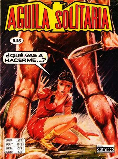
#18 The A-Frame’s Influence: How This Iconic Pose Continues to Shape Modern Fashion, Art, and Movie Posters #18
Bold Spanish lettering shouting “AGUILA SOLITARIA” crowns this pulp-style cover art, setting a dramatic tone before your eye drops to the cramped space below. A woman in a vivid red dress crouches low at the center, her arms braced wide as if forming an urgent, improvised frame against the danger closing in. Rain slants across…
-
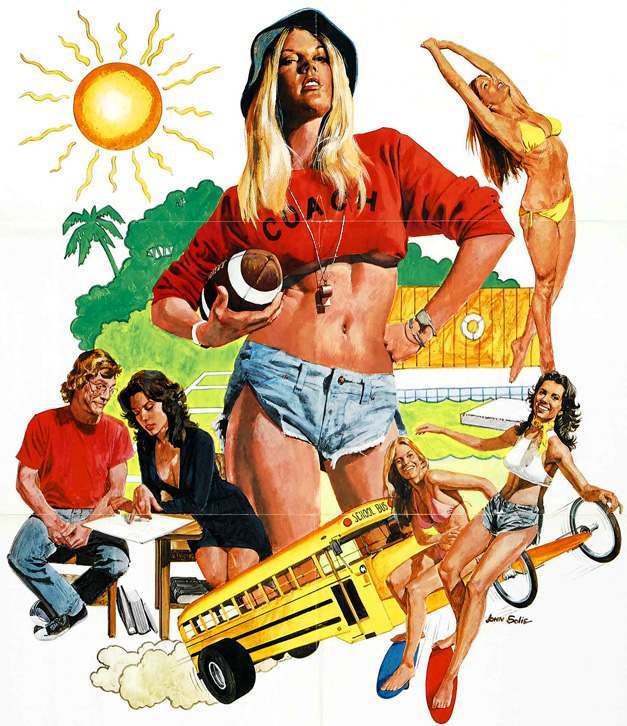
#11 Summer School Teachers (1974)
Sun-baked and unapologetically loud, the cover art for “Summer School Teachers (1974)” leans into the era’s pop illustration style, where a single oversized figure sets the tone like a billboard. Front and center, a whistle-wearing coach in a cropped sweatshirt and cutoffs grips a football, framed by a blazing sun, lush greenery, and a swimming…
-
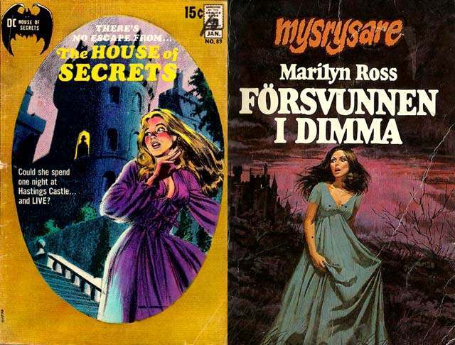
#10 The Psychological Appeal of Women Running from Houses on Gothic Romance Covers #10 Cover Art
Pulp-era gothic romance cover art thrives on the moment just before the scream, and these two examples lean hard into that charged pause. On one cover, a blonde heroine in a purple dress recoils beneath the looming silhouette of a castle, the text teasing danger and confinement with “The House of Secrets” and a breathless…
-
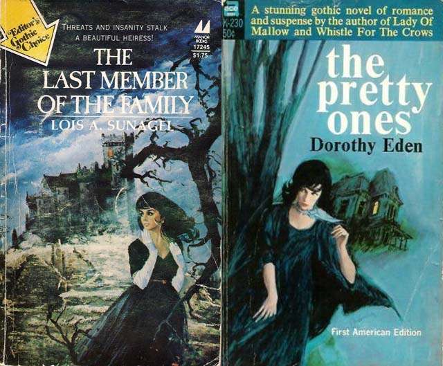
#26 The Psychological Appeal of Women Running from Houses on Gothic Romance Covers #26 Cover Art
Across many gothic romance covers, a single motion tells the whole story: a woman turning away from a looming house as if the building itself has become an antagonist. The artwork here leans hard into that familiar pulse of dread—wind-tossed hair, dark dress, and a backward glance that suggests pursuit, accusation, or a secret left…
-
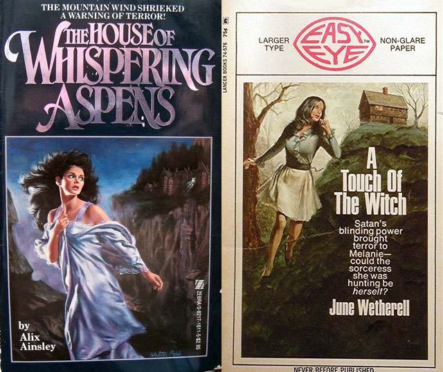
#42 The Psychological Appeal of Women Running from Houses on Gothic Romance Covers #42 Cover Art
Stormy skies, jagged cliffs, and a woman caught mid-flight—these Gothic romance cover illustrations waste no time announcing danger. One scene frames a wind-whipped heroine in a pale dress as a dark, isolated house looms behind her, while bold, dramatic typography (“The House of Whispering Aspens”) sells dread as much as desire. The visual language is…
-
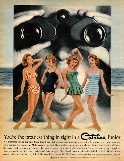
#16 Groovy Threads and Bold Ads: A Trip Through 1960s Fashion in Seventeen Magazine #16 Cover Art
A playful collision of glamour and marketing fills this Seventeen magazine–style cover art, where four swimsuit-clad models strike breezy, mid-century poses against a seaside backdrop. Looming behind them, an oversized face with binoculars turns the scene into a cheeky visual punchline, a reminder that 1960s fashion illustration often leaned on bold, attention-grabbing concepts as much…