Category: Cover Art
Dive into a gallery of vintage cover art from books, magazines, and albums. Discover how graphic design and illustration reflected the moods of their times.
These covers capture the essence of cultural evolution — from bold propaganda to elegant minimalism.
-
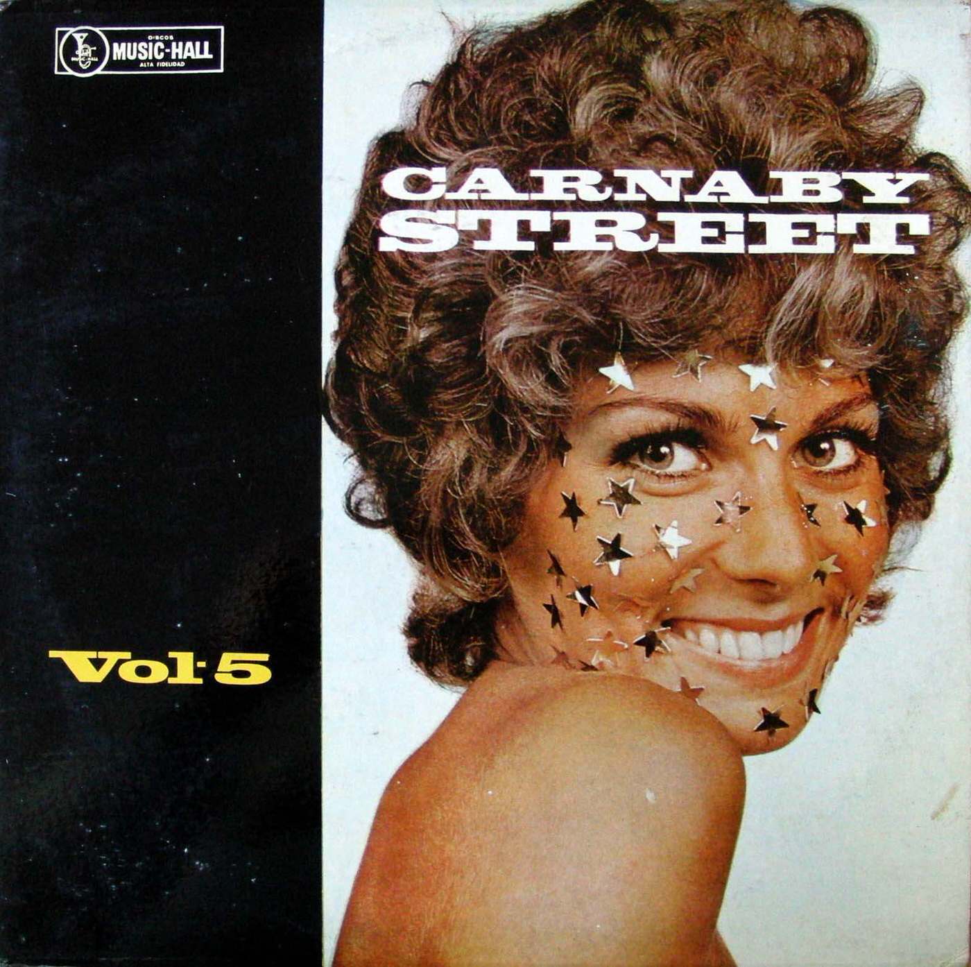
#11 The Unusual and Unconventional Album Cover Designs From the 1960s and 1970s #11 Cover Art
Bold type shouting “CARNABY STREET” stretches across a smiling portrait, instantly evoking the era when record sleeves doubled as fashion statements. Star-shaped confetti scattered over the subject’s face turns a simple studio shot into pop spectacle, while the cropped shoulder and direct gaze sell glamour more than biography. Even the clean, high-contrast layout—part black field,…
-
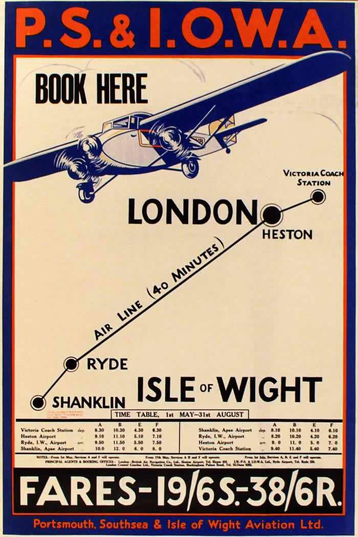
#13 Advertising the Skies: A Look at Imperial Airways Posters Promoting Early Air Travel in the 1920s and 1930s #1
Bold lettering shouts “P.S. & I.O.W.A.” above a streamlined aircraft, selling the thrill of modern flight with the blunt invitation to “BOOK HERE.” The design leans hard into interwar poster aesthetics—clean geometry, limited colors, and a dramatic perspective that makes the plane feel fast, reliable, and just within reach. Even before reading the fine print,…
-
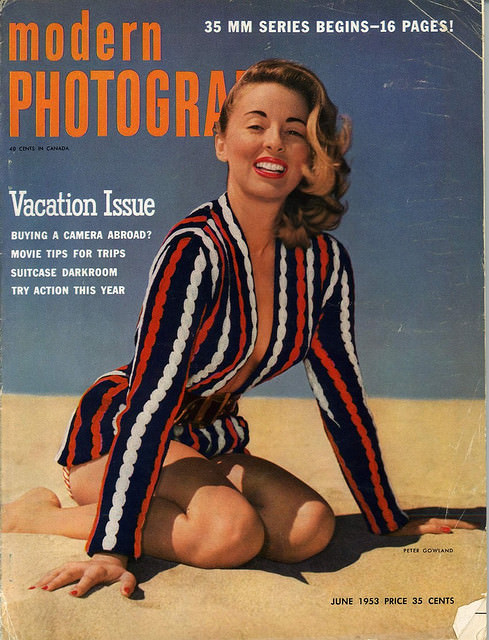
#6 A Look Back at Vintage Modern Photography Magazine Covers from the 1950s and 1960s #6 Cover Art
Bold, oversized lettering and a confident studio-on-the-sand pose set the tone on this Modern Photography cover, a “Vacation Issue” that practically sells the promise of sun, style, and new gadgets in one glance. The model’s striped jacket, bright lipstick, and easy grin feel built for the newsstand—part glamour, part everyday aspiration—while the clean background and…
-
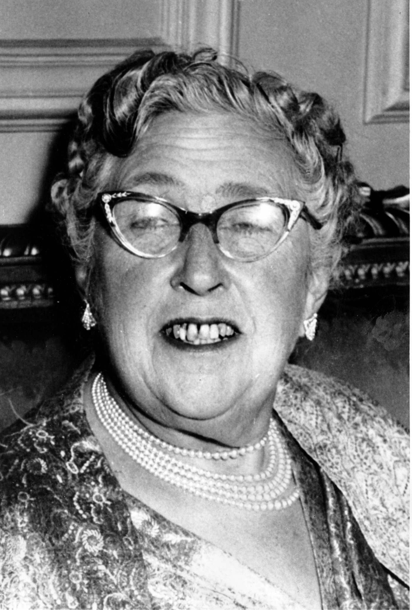
#2 Agatha Christie, 1956
Warmth and wit come through in this 1956 cover-art style portrait of Agatha Christie, presented in a tightly framed view that feels as immediate as a conversation across a sitting-room table. Her cat‑eye glasses catch the light, while carefully arranged curls, drop earrings, and layered pearl necklaces suggest a public figure comfortable with attention yet…
-
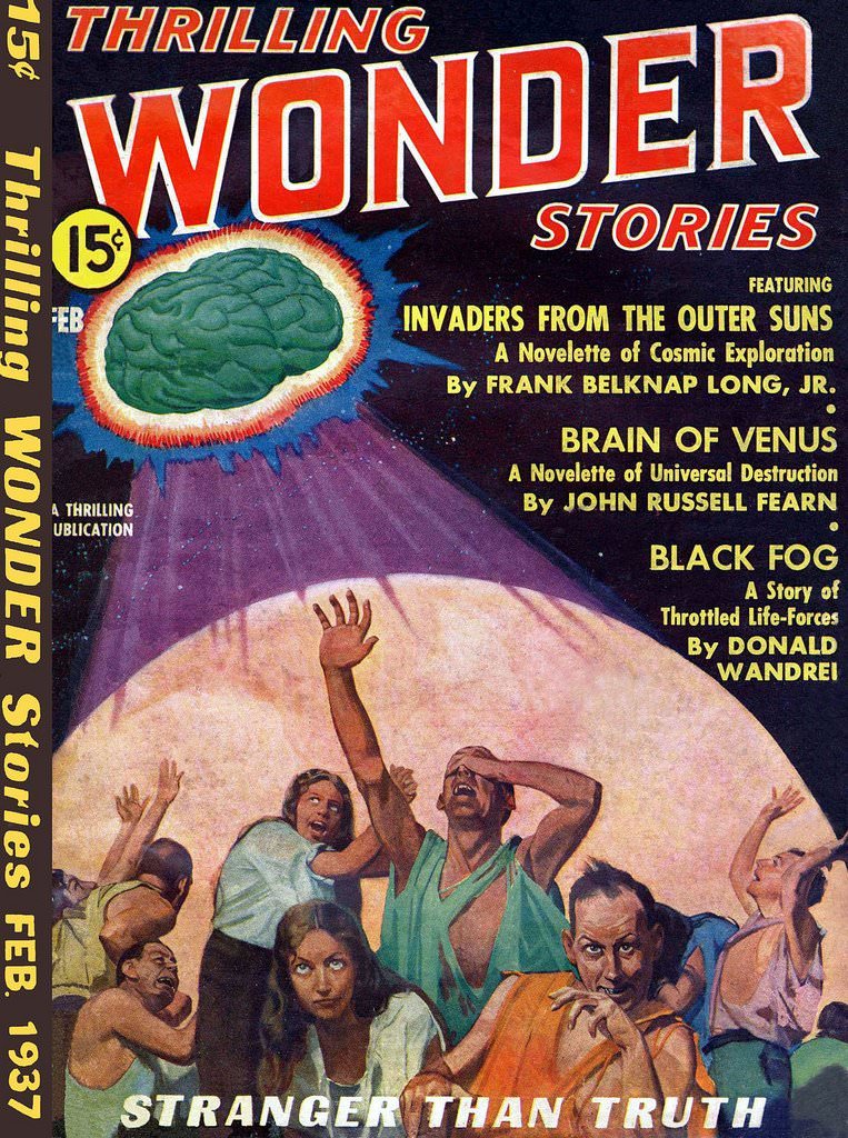
#7 Thrilling Wonder Stories, 1937
Bold pulp typography announces “Thrilling Wonder Stories” in towering letters, instantly setting the stage for 1937-era science fiction spectacle. The cover’s dramatic palette—deep space tones punctuated by hot reds, yellows, and electric light—pulls the eye to a lurid celestial scene where an enormous, brain-like form hovers and radiates an uncanny glow. Even the period details,…
-

#3 The Festival was abandoned during the war, but kicked off again in September 1946. There were TWO official posters that year, the last of which is an original illustration by Leblanc.
A ribbon of white fabric curls across a sea-blue field, carrying the words “CANNES 1946” like a celebratory banner returning to the wind. Above it, a dark frame encloses the bold lettering “FESTIVAL INTERNATIONAL DU FILM,” instantly signaling a revived international ambition after years of wartime silence. Decorative, plant-like flourishes snake around the composition, giving…
-
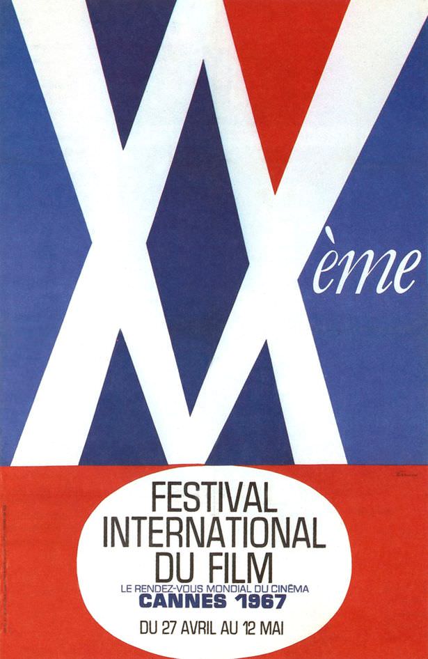
#19 1967: The patterns are meant to emulate the shapes created by spotlights in the sky. Either that or it’s going to be an X-rated festival.
Bold geometry dominates the frame: oversized white X shapes slice across deep blue, while a sharp red wedge pushes in from above like a beam of light. The playful “Xème” script hints at an anniversary edition, and the whole composition reads like spotlights crisscrossing a night sky—clean, modern, and a little cheeky in the way…
-

#11 The Birds. Artist: Bronislaw Zelek. Year: 1965
A stark field of black and white sets the mood for Bronislaw Zelek’s 1965 cover art for “The Birds,” where typography becomes atmosphere. The word “Ptaki” multiplies across the page in a rising swarm, shifting in size and density until it feels less like text and more like an oncoming threat. At the top, the…
-
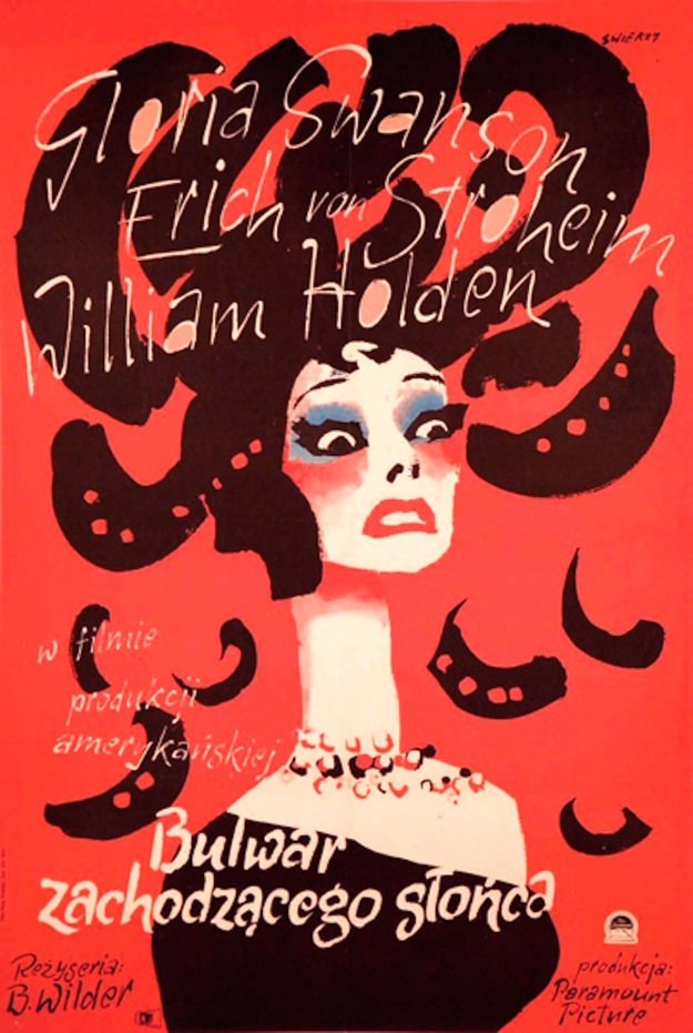
#27 Sunset Boulevard. Artist: Waldemar Swierzy. Year: 1957
Bold red floods the poster for *Sunset Boulevard* (1957), while a stylized female figure stares out with wide, theatrical eyes and a poised, mask-like expression. Dark, curling shapes billow around her head like oversized hair or looping shadows, turning glamour into something slightly ominous. The contrast between the pale face, heavy blue eye makeup, and…
-
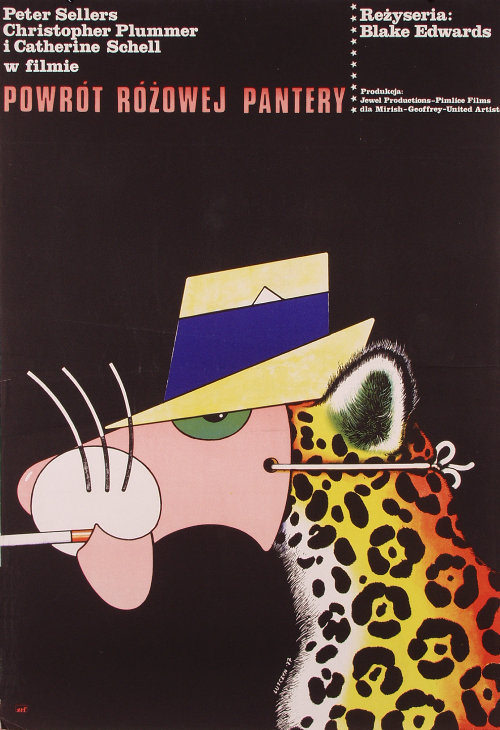
#43 The Return of the Pink Panther. Artist: Edward Lutczyn. Year: 1977
Bold color and sly minimalism set the tone for Edward Lutczyn’s 1977 cover art for “The Return of the Pink Panther.” Against a deep black field, the Pink Panther’s familiar profile slides into view with a yellow brimmed hat and a sharp blue band, one half-lidded green eye doing most of the acting. The clean…